Tuesday, 24 January 2017

Creative weekend 5 - "New style"

"New style" - a bird page with a new technique in Seawhite hardbound 7.5"x7.5" (ca. 20x20 cm) journal, finished on Monday (because of  all the interesting videos from Creativation) :0)

This page started as a acrylic mixed media background - layering of chalk and normal acrylic paints, some acrylic stamping....too messy and disappointing for me at the end, so I changed a bit my planes and finished the page in more graphic look, which I like.

But the main goal was to create the leaves with a great technique I saw on the Paper Artsy blog. Leaves are stamped on the acetate sheet with black Staz-on ink, dried (I carefully used a heat tool) and then colored from the stamped side with more layers of acrylic paint. Firstly I used 3 layers of beautiful transparent Red iron oxide from Golden and than more opaque and lighter Americana Bright orange paint and sealed all with glossy varnish medium. If you then cut the leaves out of the acrylic sheet and flip them over, the colours from the back side really shine through the clear plastic and they are perfectly protected from damage.

This is a wonderful technique and I absolutely recommend to try it :0) It is just necessary to thing carefully about the order of the colours you will place on the back side of the acetate, because your first layer of colour will be most visible one at the end. It is a reversed style, normally if you work on your page, it is your last layer which is the most visible .0)

So this page turned to be more mixed media than expected. I used Golden acrylic paint, Paper Artsy Fresco acrylic paints, Americana acrylic paints, different stamps for background texture, colored pencils from Derwent and Caran d'Ache, Twisted stencils - big and small - from Tim Holtz, skeleton leaf stamp from Florileges design, thicker acetate sheet from some stamp packaging, clothespin stamp from Penny Black's older Embellishments stamp set and I changed a bit the Prima's bird stamp from Jamie Dougherty (I stamped it with Antique linen Distress ink, redrawed the picture according my needs with permanent black liner and "erased" the rest of the "unused" lines with clean water and brush, because distress ink is water-soluble). White details are made with water-based fine Sharpie pen. Alphabet is again my latest favorite Perfectly penned font from Concord and 9th.

23. 1. 2017 New style


Tuesday, 17 January 2017

Creative weekend 4 - "New Year's resolutions" and "Beauty of pear"

Two new pages in Seawhite hardbound 7.5"x7.5" (ca. 20x20 cm) journal. First ones in this year :0)

"New Year's resolutions" made with Dylusions and  Distress acrylic paints, LaBlanche stamp and Dylusions white and black pens and "Beauty of Pear" with Distress stains, paints and markers, Penny Black stamp, simple masking technique, Distress Vintage photo embossing powder, "Perfectly penned" alphabet stamp set from Concord & 9th and beautiful white mulberry paper.

14.1. 2017 New Year's resolutions


15.1. 2017 Beauty of PEAR


Thursday, 5 January 2017

2016 Friendly Christmas gifts

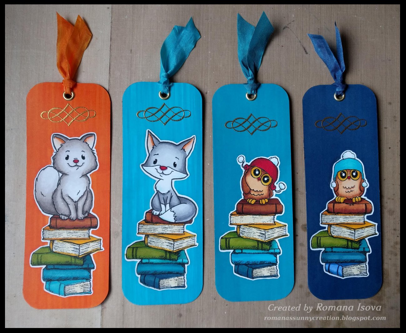
We were invited for a nice Christmas lunch to our friends and I wanted to bring something a little bit more personal to them. I decided for my previous Christmas gift idea and make the special bookmarks, also with a wishes of "Happy year". I thing they turned out very cute :0)

Colored with alcohol markers, embossed with Wow! Metallic gold rich pale embossing powder and gilded with double sided tape stripes and gold foil from Prima. Text stamped with great "Perfectly penned" alphabet stamp set from Concord & 9th. White ribbon colored with matching alcohol markers.


2016 Christmas cards

Christmas cards for 2016...that was quite an adventure :0) Sometimes your idea seems to be easy and then, during a realization itself, you find out that things go wrong or at least other way than you've imagined. So you change your plans and start again and leave this part and add another....and at the end there is the day when you really need to finished it all and send all your best wishes to your beloved as soon as possible. So you focus hard to make the cards almost perfect...during the morning, during the day, during the afternoon and evening and even the night...and at 6:30 a.m. you decide not to go to bed at all and keep your eyes open even a while longer so you can go to the post office after they open :0))
But i think it was worth it and I'm very happy that this year I also included a small gift for everybody - the bookcase with wishes of "Happy year" made with love, because I think that we all need a happiness in our lives :0)

Embossed white cardstock base colored with archival and distress ink pads plus colour cardstock background embossed with white embossing powder and colored with archival inks / colour cardstock background embossed with clear embossing powder and colored with archival inks.
Medallions: colour and white cardstock colored with distress ink pads, stamping with Ranger Black soot archival ink. Bunnies and trees colored with Distress markers and sealed with Distress micro glaze wax. Silver "mirrored" stars. Dimension to the frames added with white craft foam circles.
Bookmarks: background colored with alcohol markers, bunnies and books with Distress markers sealed with Distress micro glaze. Embossed with Wow! Metallic gold rich pale embossing powder and gilded with double sided tape stripes and gold foil from Prima. Text stamped with great "Perfectly penned" alphabet stamp set from Concord & 9th. White ribbon colored with matching alcohol markers. 

So have a great year 2017 and a lot of happiness in it :0)


Wednesday, 4 January 2017

Birthday card

Hi :0)

It was a loooong break, wow :0o But not completely without creativity, so here is a birthday card I made. On the front page it says: "It is your birthday today?" and inside: "So you should stop running for an instant, so I can congratulate to you..." .0)

BTW I love this great "Perfectly penned" alphabet stamp set from Concord & 9th. In a combination with "Liquid platinum" embossing powder from Ranger is so nice. And there is also a clear "Wink of stella" pen shine on the planets...just for a balance :0)

21.12.2016 "Space" birthday card


Sunday, 9 October 2016

Creative weekend 3 - "Rose is a rose is a rose"

Simple "Rose is a rose is a rose is a rose" page in my new Seawhite hardbound 7.5"x7.5" (ca. 20x20 cm) journal :0) Distress ink pads background, stenciling through two stencils lying on each other, stamping without and with masking technique and coloring with Distress ink pads, Distress markers and white colored pencil...

9.10. 2016


Monday, 3 October 2016

Creative weekend 2

Another small page I made this weekend in my new Seawhite hardbound 7.5"x7.5" (ca. 20x20 cm) journal :0) Distress ink pads background, water spraying through stencil, stamping with positive and negative masking and colored pencils incl. white ...

1.10. 2016


Wednesday, 21 September 2016

Tim Holtz Creative chemistry 103 adventure ends....or maybe not :0)

So here are my tags from Tim Holtz's Creative chemistry 103...


Day 1 techniques:
Distress DIY ombré (tags 1-3), Distress highlight stamping (tag 4), Distress off-set stamping (tag 5), Distress washed watercolor (tag 6), Distress Micro-glaze resist (tags 7-8)


Day 2 techniques:
Distress paint resist (tags 1-2), Distress paint lifting (tags 3-4), Distress stain rub resist (tag 5), Distress luminous mica (tags 6-7), Distress marker spritzed watercolor (tags 8-10)


Day 3 techniques:
Distress layered collage (tag 1), Texture paste coloring (tag 2), Texture paste embossing (tag 3), Texture paste resist (tag 4), Distress grit-paste grunge (tag 5)


Day 4 techniques:
Distress crayon smudge (tag 1), Distress crayon gesso fresco (tags 2-3), Distress crayon texture resist (tag 4), Distress crayon watercolor resist (tag 5), Distress crayon blended background (tag 6), Distress crayon layered coloring (tag 7)


Day 5 techniques:
Alcohol ink stamped resist on Yupo (tags 1-3), Alcohol ink texture resist on Yupo (tag 4), Alcohol ink painting on Yupo (tag 5), Alcohol ink faded layers on Yupo (tag 6-7), Alcohol ink liquid landscapes on Yupo (tag 8), Alcohol ink splattered florals on Yupo (tag 9)


Tim Holtz Creative chemistry 102 adventure continues

So here are my tags from Tim Holtz's Creative chemistry 102...


Day 1 techniques:
Distress paint marbling (tags 1-2), Colored crackle (tag 3), Altered surfaces (tag 4), Eroded metallic (tags 5-6), Stamping resist (tags 7-8), Industrial (tag 9)


Day 2 techniques:
Mixed-media layering (tag 1), Embossing with stencils (tags 2-6), Embossing through stencils (tags 7-9)


Stencil stamping (tags 10-11), Stencil sketching (tag 12), Ink monoprint (tag 13-14), Paint monoprint (tag 15)


Day 3 techniques:
Smudge stamping (tag 1), Brayered stains (tags 2-3), Photo tinting (tag 4), Faux cracked glass (tags 5-7), Distres glitter Rock candy (tag 8), Distress glittering (tag 9)


Day 4 techniques:
Faux patina (tag 1), Faded layers (tags 2), Ombré (tag 3), Monoprint (tag 4-6)


Day 5 techniques:
Rusting with distress powder (tag 1), Sticky powder with glitter (tag 2), Sticky powder with leafing (tag 3), Shabby chic (tag 4), Tarnished silver (tag 5), Chalkboard (tag 6)


Tim Holtz Creative chemistry 101 adventure

Summer was quite busy, but I still had some time for creating. I spent few very nice weeks with Tim Holtz's Creative chemistry courses 101, 102 and 103 and it was a great adventure to discover or re-discover all the techniques he shows in his video lessons :0)

On the beginning of Creative chemistry 101 I decided not to use only Tims's Manila cardstock, but try a different kinds of papers I have and I could use in the future for my art pieces instead, so I have a better references how these papers behave, how they take water, colors and stamped images. I used more than 10 types of papers - watercolor, mixed media, kraft, black, specialty, even photo paper and mostly I was very happy with the results, although sometimes was a bit difficult manage the technique on them. And if I loved some technique a lot I made a few (or more) tags with it :0)

So here are my tags from Creative chemistry 101...

Day 1 techniques:
Blended spritz and flick (tags 1-4), Brushless watercolor (tags 4-5), Wrinkle-free distress (tag 6)


Day 2 techniques:
Alcohol ink agates (tags 1-2), Archival resist (tags 3-4), Reflections stamping (tags 5-9)


Day 3 techniques:
Watercoloring with re-inkers (tag 1), Layered misting (tags 2-5)


Day 4 techniques:
Stained kraft resist (tags 1-4), Stamping with stains (tags 5-6), Marbled stains (tags 7-8)


Day 5 techniques:
Watercolor with markers (tag 1), Blending with markers (tag 2), Stamping with markers (tag 3-5)


Day 6 techniques:
Rusted enamel (tags 1-3), Nostalgic batik (tag 4), Distress powder resist (tag 5)


Day 7 techniques:
Dabber resist (tag 1), Crackle paint resist (tag 2), Shattered stains (tags 3-4)


Day 8 techniques:
Perfect distress mist (tags 1-2), Perfect distress (tags 3-4), Perfect splatter distress (tag 5-6)
Day 9 technique:
Rock candy distress stickles (tags 7-8)


Monday, 29 August 2016

Clouterie - Guest Design Team spot for Chocolate Baroque - with photo tutorial :0)

This post is really exciting for me :D. Today I can show you a project I made for Chocolate Baroque stamps as a Guest Design Team member. It's been posted freshly on their Design team blog here.

As a winner of a Spring art competition earlier this year (with a Spring art journal page) I received this great opportunity to make another project with their beautiful stamps. On my blog I would like to show you step by step process, how I created this "textile shop window". And you can find the list of all the materials and colors I used at the end of this blog post :0)


a) first I made a colored paper for a shop window. I sprayed watercolor paper with water, added red Brusho powders and a pinch of blue. Then I used a brush to make a first layer of color. Until I had the final color I wanted, I kept adding the water and red powders and also just a little bit of Brusho Emerald green, because it is an opposite color of the red on the color wheel and make the red more dull. I always moved the brush in the same direction (from right to left and back), so at the end I had a texture resembling the wood grain. After everything was completely dry, I used Lascaux Satin matt acrylic medium as a sealer. I cut the paper into strips, scored them a little bit for the texture, finished the edges with Jet black archival ink and used the double sided tape adhesive tape to connect them into the shop window.


b) then I sprayed my background watercolor paper with water, I added Merlot Color burst powder and with the brush made my base flat color layer (quite pink). I let it air dry, so the final color was more vibrant. After that I stamped background stamp repeatedly with clear Versamark ink on the dry page and than sprinkled the page gently with Merlot Color burst and Prussian blue Brusho powders. With the dry brush I worked the powder into the pattern stamped with Varsamark. Than I sprayed the page with water again and spread the both colors on the page with brush . The stamped pattern remained darker, but it's necessary to be careful with the water (with too much water the dry pattern will be too blur and also with too much powders - they are very intense - the darker will be whole page and the pattern less visible at the end). I trimmed the paper a little bit, so it is slightly narrower than the shop window and can be completely hidden under it.


c) I stamped drapery, carpet, mannequins, corners, shop sign and haberdashery pieces on the mixed media paper with Jet black archival ink and heat set it with my Tim Holtz heat tool, so I could color them with Distress ink pads without smudging. I cut them out and finished all the edges with black waterproof Faber-Castell India ink marker. For the haberdashery I cut out separated masks (from sticky masking tape I stamped the pictures on) for brown and colourful parts, so I could color them safely without mixing the colors. I used Tim Holtz foam applicators and also helpful Tsukineko daubers for smaller pieces. 
For the shadows on the mannequins and all other pieces I used Hickory smoke Distress ink.


Corner stamp I stamped twice and drew a border around both pieces by hand. I colored them with Distress inks and than I lightened up some parts with clean water brush, so they look more dimensional. I wet the areas with water and then removed the excess color with dry paper towel. Left corner is before the and right one after I used the water brush. I am very happy with the wood like look and texture of the corners and the shop sign. It is also thanks to a texture of the Canson paper I used. 

The same lightening process I used on the strawberry patterned violet ribbon (my "carpet steps"). 


And I also decided not to use the thimbles I embossed with silver embossing powder. They would be too contrasting with other elements around.


d) I cut out rectangles from white silk wrapping paper I had from my birthday flowers and I sprayed them with Distress sprays in rainbow colors. I dried it with my heat gun. After that, for every piece I used a darker Distress ink pad color to stamp a patter on it and dry it again. I crumpled he papers several times so it was easier to work with it and arranged it around the mannequins. I used the colored paper ribbons from my stash and stamped buttons to finished the look of the textiles.


e) Finally I completed the page. For more dimensional look I used also a black adhesive fun foam. I used two layers under the shop window and also the drapery and one layer on the back side of the mannequins and lower step of the carpet. So the final layers of the page are - black card stock in the same shape as the shop window as a base for the whole page, violet background patterned paper, one layer of the fun foam frame around the page, upper carpet step directly on the background violet paper and lower carpet step with one layer of the fun foam on the back . Then the mannequins with one layer of the fun foam on the back side and the haberdashery on the upper and lower steps of the carpet. After that the second layer of the fun foam around the page and under the top drapery and on the top of it the corners with shop window and shop sign. 

For bigger parts I used the double sided adhesive tape, but the mannequins stands are glued with Distress collage medium and the haberdashery with Rangers Glossy accents which I also used (in small spots) under the "fabrics".


And here it is - the final project once again:


For the project I used:

Stamp sets from Chocolate baroque:
Floral Mannequins and Haberdashery, Texture Fragments for "textile" patterns, Damask Panel for background pattern and corner stamp from Steampunk Butterfly

Colors: 
for the shop window: mix of Brusho watercolor powders - Scarlet, Crimson, Prussian Blue and Emerald green and Color Burst watercolor powder - Merlot, 

for background: mix of Prussian Blue Brusho powder and Merlot Color Burst powder, 

for drapery and carpet: Tim Holtz Distress ink pads Milled lavender, Seedless preserves, Dusty concord, 

for fabrics: Distress ink sprays Spun sugar, Mustard seed, Spiced marmalade, Twisted citron and Tumbled glass and Distress ink pads Milled lavender, Wild honey, Carved pumpkin, Peeled paint and Broken china and for the haberdashery pieces: Distress ink pads in all these colors, 

for brown pieces: Distress ink pad Vintage photo and 

for shading of all pieces: Distress ink pad Hickory smoke. 

Papers: 

slightly textured Hahnemuehle Toscana 90 lbs watercolor paper 24x32 cm for background and shop window, Canson Mix Media 138 lb for all stamped pieces, silk (flower wrapping) paper for "fabrics".


Thank you so much for your patience and support. I really appreciate all your comments and nice words I can read on the Chocolate baroque blog and here :0)


Have a nice week and maybe see you some day with another Guest design team spot :0)


Thursday, 4 August 2016

Playful art journal page 15

A little bit tricky summer beach page :0)

For sand, water and sky I used Distress ink pads and stamped the pictures with Hero arts Shadow inks and brown Ranger Archival inks. Because the colors were a little bit patchy I used also Derwent Coloursoft coloured pencils. I used mostly a foam textile stamp set from Aladine called Navy, these stamps have a great size for paper also and are easy to use.

I'm very happy with a lazy and playful holiday atmosphere I feel from this page. I hope you will enjoy it also and I wish you a lot of sunny happy days :0)


3.8.2016 Playful art journal page 15


Creative weekend 1 - a few eclectic pages :0)

Just a few small pages I made this weekend in my new Seawhite hardbound 7.5"x7.5" (ca. 20x20 cm) journal :0)

29.7.2016


30.7.2016


31.7.2016


31.7.2016


1.8.2016
(very difficult to make a picture of this, I used Distress Mermaid lagoon and Salty ocean inks and also Wink of stella clear glitter pen and Tim Holtz Rock candy clear glitters with sticky embossing powder and nothing of this is visible on the photo...)


Monday, 25 July 2016

Playful art journal page 14

Page inspired by beautiful Japanese lacquer art :0)

A lot of layers this time. I colored whole page with black Dylusions paint and than stamped  the bamboo stamp pattern with Versamark and embossed it with WOW Super fine gold embossing powder. I die-cut the koi fish from different textured papers used them as a background pattern and as my focal point also. another layer is a black cardstock as a frame and than another one embossed with Sheena Douglass embossing folder and gilded with Inka gold paste from Viva decor. Edges are embossed with WOW Ultra high embossing powder. Than I cut out the circles - one from black cardstock embossed with this gold powder again and second one with black silk paper - stamped with Versamark and embossed partially with WOW Ultra high and partially with WOW Super fine gold embossing powders. Lotuses are a combination of Waffle flower and Altenew stamp sets. I stamped them on patterned papers - pearly white and green one gold embossed with Chinese characters stamp. Leaves are colored with Distress ink pads and flowers with very light green alcohol markers. Also the main koi fish are colored with alcohol markers and for more dimension I also used a die-cut black fun foam on their back side.

24.7.2016 Playful art journal page 14


Tuesday, 19 July 2016

Playful art journal page 13


After a long time a new art journal page titled "Oh, what a world I am dreaming about?" :0)

Background was made with Distress ink pads - Seedless preserve and Mermaid lagoon. Firstly I applied the colors with sponge applicator and than I stamped two text stamps from Carabelle studio over it with the same ink pads. After that I sprinkled the page with water and dry it with dry paper towel and than with my heating tool. I wanted to make a bokeh effect with white pigment ink -  Hero arts Unicorn and Lots of dots clear stamp set from Simon Says Stamp. The result was quite different and surprising than expected, but still wonderful, although when the pigment ink dried completely, the circles changed a color a lot as the ink took the colors from the distress background :0)

Theme of the page was a dreamy scene, so I left my main character - the girl, which dreams - in brown colors and the dream itself is colorful. I stamped her and other images with Coffee archival ink pad on the Tim Holtz plain tissue wrap paper and embossed them with Wow ultra fine embossing powder. Then I cut everything out and glued it on the page with Tim Holtz Collage matte medium. But before I glued the girl, I stamped her lightly directly on the page with Sky blue archival ink pad and colored the face, hair, hands and apron with Tim Holtz Picket fence white paint. Tissue wrap paper is too transparent when you glue it with the medium directly on the page and the background would be too visible through the glued picture without it (but she has a blue tint of the background regardless of it). I also used Tim Holtz mini bricks stencil and with the help of the paper mask I made a path with Coffee archival ink pad. I colored the glass tubes with alcohol markers and stamped my quote with Unicorn white pigment ink and highlighted the letter with Sharpie white paint marker. Finally I made some highlight all over the page with white Gelly roll pen from Sakura.

19.7.2016 Playful art journal page 13