Showing posts with label stamps. Show all posts

Sunday, 16 July 2017

Scrap art journal 4 - Dragonflies

"Dragonflies" - 4th page in my Scrap art journal series (square 28 x 28 cm /cca 11" x 11").

The journey out of my comfort zone continues :0)...
This time I wanted to transform the scrap papers in a new way. The original paper was brown with colored dots. I embossed it with an embossing folder and carefully used a darker brown Distress ink over the page. The ink hit the embossed parts mostly, so the new leaves design has nicely appeared. I used the same technique with the green scrap paper, which I cut in squares then and framed with brown Distress ink.
Newly I also used a cotton rag paper, which is a rough hand made paper from India and it's very firm and beautifully textured. I used it for the moon (together with a silver foil leafing technique) and the maple leaves. Although I used a lot of liquids on those elements, the texture of the paper is still there and I love it a lot.

The dragonflies were stamped on a transparency with Staz-On ink and colored from the reverse side with a green alcohol marker. For the silver shine on the wings I used a silver Krylon pen - again from the reverse side, so the black stamping is still visible. I tried to use just a thin layer of the silver pen, so the wing are a bit transparent at the end.
Leaves were stamped on the colored cotton rag paper with silver pigment ink and embossed with Ranger detail silver embossing powder. And the white-silver string was over-painted with silver Distress paint.
As I final touch I used the silver and gold mirrored stars all over the background - after all, it is a night scene still, right? :0)

Thank you again for stopping by, have a great days and "see" you next time :0)

15.7.2017 Scrap art journal 4 - Dragonflies


Tuesday, 11 July 2017

Scrap art journal 3 - Bubbles

"Bubbles" - third page in my Scrap art journal series (square 28 x 28 cm /cca 11" x 11").

For this page I've chosen the same pattern paper with stripes and the same Bloom girl from Prima Marketing as for my previous "Tell him..." scrap journal page.
I tried to transform this paper a bit differently with help of Tim Holtz Harlequin stencil, Peeled paint, Ground espresso and Black soot Distress inks. Then I created the bubbles with white gesso and white Caran d'Ache Neocolor 11 water soluble wax crayon. The rest is just stamping with black archival ink and coloring with white acrylic paint marker and black india ink marker. For the girl I used my alcohol markers again.
This page could be the sister of the previous one, but I'm very happy, how different they are :0)

Thank you again for stopping by, enjoy your crafty days and "see" you next time :0)

11.7.2017 Scrap art journal 3 - Bubbles


Tuesday, 20 June 2017

Art journal page - African moments

"African moments" - black and white vs. colors art journal page (cca 22 x 34 cm / 8,5" x 13,5").

I started with black and white background - simple 1st, 2nd and 3rd generation stamping of a few Sheena Douglass and Darkroom door stamps with Ranger black archival ink on a white cardstock - one page with elephants oriented to the right side and one with giraffes going to the left. Then I cut the pages in stripes, defined the edges with Distress black ink pad and placed them in a collage on a black cardstock, together with white ribbon stripe and black filmstrip die cut in the middle. Because I love this background so much, there are also some pictures of this process ...

Then I cut 3 postal frames from black cardstock, put the white cardstock pieces in them and stamped my African sunset scene. I also stamped 3 extra trees on a white cardstock and glued them on the black cardstock for extra dimension. For my quote I used Tim Holtz smaller alphabet stamp. I colored all this elements with Distress inks - Scattered straw, Mustard seed, Spiced marmalade, Rusted hinge, Vintage photo, Tumbled glass and Broken china. Finally I added a few highlights with a white gel pen and a shading around the focal points with smudged black pastel pencil.

My goal for this page was a combination of black and white background with colorful focal points and it was pleasant experiment and surprisingly challenging. Maybe you will like the outcome as much as I do :0)

Thanks for stopping by and see you next time :0)

20. 6. 2017 African moments


P.S. ...to see more details, open the pictures (link) in the new tab :0)

Monday, 1 May 2017

Art journal page - Gallery Of Roses

"Gallery Of Roses" -  double page from a small Dylusions journal (cca 20 x 25 cm / 8" x 10").

I played with a background a little bit, I sprayed through a Tim Holtz Floral stencil with Dylusions Ground coffee spray, let it dry and over spray the page with Dylusions Lemon zest and Pure sunshine sprays. On the dry page I then use another Tim Holtz stencil - Dot fade - with Lemon zest Dylusions paint. Acrylic paint is still visible, even on the places where I stamped Kaisercraft medallions and silhouettes stamps with black archival ink.

U die cut the frame from ordinary paper, scanned it with my Scan-n-Cut machine, re-sized it a bit (I needed it bigger and a slightly narrower) and cut it with the machine from the cardstock. The final frame is painted with the black Dylusions paint and "dry brushed" with Viva Inka gold wax (Old gold color).
The background of the frame is again the black painted cardstock with gold embossed letters. For the ornaments I used Versamark ink and gold Pan pastel brushed over it. Central picture is a die cut oval painted with yellow Dylusions paints and sprays and a silhouette die painted with black Dylusions paint.

Finally I embossed the roses stamps from Studio Light with black embossing powder, cut them out and colored with yellow and green Color Burst powder pigments. The embossed lines make a nice boundaries for this watercolor coloring.

This page is also my entry for a Simon Says Stamp new Wednesday challenge: Anything goes. You can visit it here.

Thanks for stopping by and see you next time :0)


30. 4. 2017 Gallery Of Roses


P.S. ...to see more details, open the picture (link) in the new tab :0)


Saturday, 22 April 2017

Playful journal page 16 - Phoenix and Dragon

Phoenix and Dragon - an art journal page inspired with Chinese decor :0)
According to the Chinese mythology the Phoenix was a symbol of the Empress and the Dragon with five fingers belonged to the Emperor. For a long time a yellow color was reserved for a monarch and in the Chinese culture has a very important meanings still. 

For the background I used one of Spellbinders Medallion dies. I cut it 6 times and glued the decor on the page. Then I covered all the page with the black Dylusions paint and highlighted the medallions with an Old gold metallic wax (Inka gold) from Viva Decor.
I painted white cardstock with Calypso teal Dylusions paint, stamped the clouds with clear Versamark ink and embossed with gold embossing powder. Then I teared two stripes off it and used the same gold wax on the edges.
On the white cardstock sprayed with Lemon zest and Pure sunshine Dylusions sprays I stamped the Phoenix and the Dragon, again with Versamark, and embossed them with the gold embossing powder. I used one of my label dies to cut them out. The same technique I used for the coins, which were stamped on the white cardstock painted with the mix of Pure sunshine and Calypso teal Dylusions sprays (they mix in a beautiful range of greens).
At the end I painted a brown ribbon with the gold wax and fastened the coins on it with a small pieces of wooden skewer painted with a black Dylusions paint. All stamps I used for this page are from two very nice sets from Local King rubber stamps.

Because I used a limited range of colors, the whole page is nicely consistent and with the all gold accents looks really beautiful.

If you like the page too, feel free to leave me a comment. Thank you for stopping by, have a nice days and see you next time :0)

21.4.2017 Playful art journal page 16 - Phoenix and Dragon


P.S. ...to see more details, open the picture (link) in the new tab :0)

Tuesday, 11 April 2017

Art journal page - Night talk

"Night talk" - art journal page in Canson Mix Media middle art book - 17 x 25 cm (cca 6.5" x 10")

I wanted to try Viva Decor Ferro texture paste in Steel color. It looks so nice on this black background and has a great shine, although it is not much visible in the picture :0).
I covered the page with Black marble Dylusions paint and used two metal wisteria stencils, Clarity stamp alphabet stencil and The Crafter's workshop dotted stencil with the paste.

Then I stamped moon with stars and one of the Tim Holtz crazy birds and a new awesome Dylusions dog with white Dylusions paint. Because I stamped it on the white paper covered with black Dylusions acrylic paint, white color turned into lilac. If I would stamped it directly on a black cardstock it would stay white.
For the white highlights and text I used Sakura Souffle gel pen, it dries bright white and is a bit dimensional.

It is a simple page, but I really like the outcome and the texture :0)

10. 4. 2017 Night talk


P.S. ...to see more details, open the picture (link) in the new tab :0)

Wednesday, 5 April 2017

Creative weekend 8 - "Spring wind"

Spring wind - an art journal page in Seawhite hardbound 7.5"x7.5" (ca. 20x20 cm) journal.

Pastel colors background created with a few stencils (Tim Holtz) and stamps (Crafter's Companion) using Tsukineko VersaMagic Dew Drops chalk inks and stencil brushes. Some brushes I used were from Clarity stamps and some just no-named, but the same shape, cheaper brushes from hardware store. The results are the same - very nice :0) For this page I was inspired by Sari Hänninen's recent stenciling technique shown in the second half of this video: https://www.youtube.com/watch?v=hcPliZiM6Sw&t=61s.

The final background reminds me a mosaic floor, so I wanted to stay mostly 2D with my page. I used Tim Holtz Kraft-core gold metallic cardstock to die cut my letters (Memory Box) and a compass (Cheery Lynn) and white cardstock for my feathers (Simon Says Stamp) which I colored with the same VersaMagic chalk inks used on the background. Only the feathers I wanted more dimensional, so I used a bigger blobs of 3D matte gel to glue them down and the gel does a really great job :0)

Have a nice spring days and thanks for stopping by :0)

4. 4. 2017 Spring wind


P.S. ...to see more details, open the picture (link) in the new tab :0)

Tuesday, 28 February 2017

Distress oxides first look - backgrounds and stamped tags

This weekend I opened my new Distress oxide inks. I tried them a bit, just to know how they look like alone, in the combination with traditional Distress inks or stamped and misted.  So I made just a few small tags.

They are nice to play with, I need to say, although if you want to make a nice combo of Distress inks and Distress oxides, it is better to be a careful with the oxides. Too much oxides can hide the vibrant colors of Distress inks and make all background too dull. And also some oxides seem to be stronger than others e.g. brown ones, so put pink oxide over the larger spot of brown one is a bit difficult, after water mist pink oxide kind of soaked into the brown one and disappeared. But maybe I need just try more :0)

And for the water mists I prefer older Ranger Mister bottle to a newer Distress Sprayer one, because with the mister you have a better control over the water amount and it is really just the water mist and no big droplets of water, so oxides start to shine but they don't bleed too much (for me, this is important when I stamp with oxides).

But mostly (and with a bit of practice) they make a very nice and unusual backgrounds and I really love the combo with Distress inks. The contrast of the matte and bright colors is incredible and sooooo nice :0)

So here they are - the first tags I made, for more detailed look open every image in a new tab:

1) Distress inks and Distress oxides combo: 
a) first tag is Broken china Distress oxide over Mustard seed and Spiced marmalade Distress inks 
b) second tag Fossilized amber, Spiced marmalade and Vintage photo Distress oxides over Salty ocean and Mermaid lagoon Distress inks


2) combo and mix:
a) first tag is a combo of Broken china and Vintage photo Distress oxides over Mustard seed and Spiced marmalade Distress inks
b) second one is a pure Distress oxides mix - Fossilized amber, Mustard seed and Broken china distress oxides


3) Distress oxides mix: 
a) first tag Broken china, Wilted violet and Faded jeans Distress oxides 
b) second tag Worn lipstick, Wilted violet and Faded jeans Distress oxides


4) stamping with Distress oxides on white and kraft cardstock. Both sprayed with water more times - sprayed, dry with heat tool, sprayed, dry, sprayed, dry... .0). Bleeding of the blue colors on the kraft cardstock is not much visible, after the paper is dry.
a) Vintage photo and Walnut stain Distress oxides on the white tag 
b) Broken china and Faded jeans Distress oxides on the kraft cardstock 


5) background of all this tags made with Wild honey, Vintage photo and Ground espresso Distress inks and images are stamped over with 
a) Faded jeans Distress oxide (tulips) and Pumice stone Distress oxide (crackled pattern). I also covered this tag with liquid gloss acrylic medium, so all colors are more vibrant and have more depth - the tag resemble a glass tile. 
b) Broken china Distress oxide
c) Worn lipstick Distress oxide
Every tag is misted with water more times till the dye part of oxides started to bleed into the background colors. Especially on the third tag the Worn lipstick made a nice darker pink halo effect around the stamped image. On other two tags I used a glue stick and gold foil on the borders.


Thursday, 23 February 2017

Art journal page - You can sail and you can fly...

"You can sail and you can fly, under water, in the sky" - another small journal double page from Dylusions journal (cca 20 x 25 cm / 8" x 10").

When I started with my previous journal page (London bridge), I didn't want to waste the beautiful Dylusions inks I sprayed for my background, so I pushed another double journal page against the first one and transferred the excess ink to it. As you can see, these inks are so strong that even this second page is as vibrant as the first one  :0)

So here is again a background with Bubblegum pink, Crushed grape and Calypso teal and some water droplets. I made an easy pattern with Black marble Dylusions paint and two stencils (The Crafter's workshop and Joggles) making also some circles and stamped most of the stamps from a new Layering marble stamp set (Waffle Flower) with Tsukineko Brilliance Platinum planet pigment ink around the page. For more dimension I shaded the circles with Distress Hickory smoke and Picket fence inks.

Stamps (Chocolate baroque boat and Carabelle studio origami birds and fish) are colored with Dylusions inks in waterbrushes. They were cut with white border and glued on a second (slightly bigger) black cardstock layer for more depth. White-silver string was strengthen with mate acrylic medium, so it holds its shape better and a white gel pen was used for highlights. Quote was printed on a small label printer machine.

This page is also my second entry for a Simon Says Stamp new Monday challenge: Transport it which you can visit it here and also the first entry for their Wednesday challenge: Anything goes here.

It seems that it is difficult to stop, when you start to play with Dylusions colors :0)

23. 2. 2017 You can sail and you can fly, under water, in the sky


P.S. ...if you want to see more details, please open the picture (link) in the new tab :0)

Wednesday, 15 February 2017

Creative weekend 7 - "A fashion moment"

A fashion moment - an art journal page in Seawhite hardbound 7.5"x7.5" (ca. 20x20 cm) journal.

Simple two colors watercolor background in pink and violet with pattern of ferns (Inkadinkado stamp) stamped with clear Versamark ink all over the page and covered with silver Pan pastel. I used gray Distress ink and the same stamp for the stenciled silhouettes.

I was extra happy doing this page, because I made these stencils myself using Dingbats PC font of women's silhouettes. It is "Sewing patterns" font from dafont.com - every lower-case and every upper-case letter on your keyboard is a different silhouette. And there is a whole large category of Dingbats fonts on this web site prepared to be used :0).
I changed this font into .svg file in Inkscape program and then transformed this "3 letters-silhouettes" file in Brother Scan-n-cut canvas on-line program into a great custom stencil pattern I cut with my Scan-n-cut cutting machine.
It was fast and easy, even if I tried it for the first time. I followed some youtube tutorials from applelover53. This lady has really awesome tips and tricks for Inkscape and Scan-n-cut including several nice and easy videos how to use dingbats e.g. HERE or HERE. Or just write "dingbat" into the searching box on her youtube channel and you will find much more :0)

I finished the page with the beautiful circle stamps (Lavinia stamps), a stitch stamp (Technique Tuesday), black archival ink, white chalk marker and a small label maker :0)

14. 2. 2017 A fashion moment


Tuesday, 7 February 2017

Creative weekend 6 - "Golden Ginkgo"

Another journal page started during a weekend and finished on Monday in Seawhite hardbound 7.5"x7.5" (ca. 20x20 cm) journal.

"Golden Ginkgo" started as a simple two colored watercolor background. Mix of dark and light green and dark blue watercolors created very nice turquoise - blue blend, although I used a very cheap old watercolors I have. I just spritzed it a bit with water and dried with a heat tool and a paper towel. Wet colors looks great, but dried with the heat tool they become quite dull.  So then I used a glossy acrylic medium (varnish) over the whole page and they started to shine again :0).
I used an older clock stencil with copper acrylic paint and the fish (Local King rubber stamps) and oriental text (Artemio) stamps with a darker gold acrylic paint. And on top another layer of glossy acrylic medium, so everything is nicely bright and sealed.
After that I painted one sheet of paper with lighter gold acrylic paint and used a ginkgo leaf die (Impression Obsession) from my stash. Because I was not quite satisfied with the gold acrylic color on the leaves, I tried to find some alternative I could use. Finally I over-painted all the leaves with Winsor & Newton gold drawing ink. This ink is incredibly shiny and beautiful and the color is exactly the lighter gold I wanted, because the main idea for this page was to make a gradation of metallic colors from dark to light :0)
At the end I made some shading around and under the leaves with grey PIT artist pen brush markers.

And because I'm not able to decide which photo I should use for this project, here are more examples how the page change in the sunlight :0)

P.S. If you would like to see any of the photos on this blog bigger and more detailed, just open it separately in a new tab :0)

6. 2. 2017 Golden Ginkgo


Tuesday, 24 January 2017

Creative weekend 5 - "New style"

"New style" - a bird page with a new technique in Seawhite hardbound 7.5"x7.5" (ca. 20x20 cm) journal, finished on Monday (because of  all the interesting videos from Creativation) :0)

This page started as a acrylic mixed media background - layering of chalk and normal acrylic paints, some acrylic stamping....too messy and disappointing for me at the end, so I changed a bit my planes and finished the page in more graphic look, which I like.

But the main goal was to create the leaves with a great technique I saw on the Paper Artsy blog. Leaves are stamped on the acetate sheet with black Staz-on ink, dried (I carefully used a heat tool) and then colored from the stamped side with more layers of acrylic paint. Firstly I used 3 layers of beautiful transparent Red iron oxide from Golden and than more opaque and lighter Americana Bright orange paint and sealed all with glossy varnish medium. If you then cut the leaves out of the acrylic sheet and flip them over, the colours from the back side really shine through the clear plastic and they are perfectly protected from damage.

This is a wonderful technique and I absolutely recommend to try it :0) It is just necessary to thing carefully about the order of the colours you will place on the back side of the acetate, because your first layer of colour will be most visible one at the end. It is a reversed style, normally if you work on your page, it is your last layer which is the most visible .0)

So this page turned to be more mixed media than expected. I used Golden acrylic paint, Paper Artsy Fresco acrylic paints, Americana acrylic paints, different stamps for background texture, colored pencils from Derwent and Caran d'Ache, Twisted stencils - big and small - from Tim Holtz, skeleton leaf stamp from Florileges design, thicker acetate sheet from some stamp packaging, clothespin stamp from Penny Black's older Embellishments stamp set and I changed a bit the Prima's bird stamp from Jamie Dougherty (I stamped it with Antique linen Distress ink, redrawed the picture according my needs with permanent black liner and "erased" the rest of the "unused" lines with clean water and brush, because distress ink is water-soluble). White details are made with water-based fine Sharpie pen. Alphabet is again my latest favorite Perfectly penned font from Concord and 9th.

23. 1. 2017 New style


Tuesday, 17 January 2017

Creative weekend 4 - "New Year's resolutions" and "Beauty of pear"

Two new pages in Seawhite hardbound 7.5"x7.5" (ca. 20x20 cm) journal. First ones in this year :0)

"New Year's resolutions" made with Dylusions and  Distress acrylic paints, LaBlanche stamp and Dylusions white and black pens and "Beauty of Pear" with Distress stains, paints and markers, Penny Black stamp, simple masking technique, Distress Vintage photo embossing powder, "Perfectly penned" alphabet stamp set from Concord & 9th and beautiful white mulberry paper.

14.1. 2017 New Year's resolutions


15.1. 2017 Beauty of PEAR


Thursday, 5 January 2017

2016 Friendly Christmas gifts

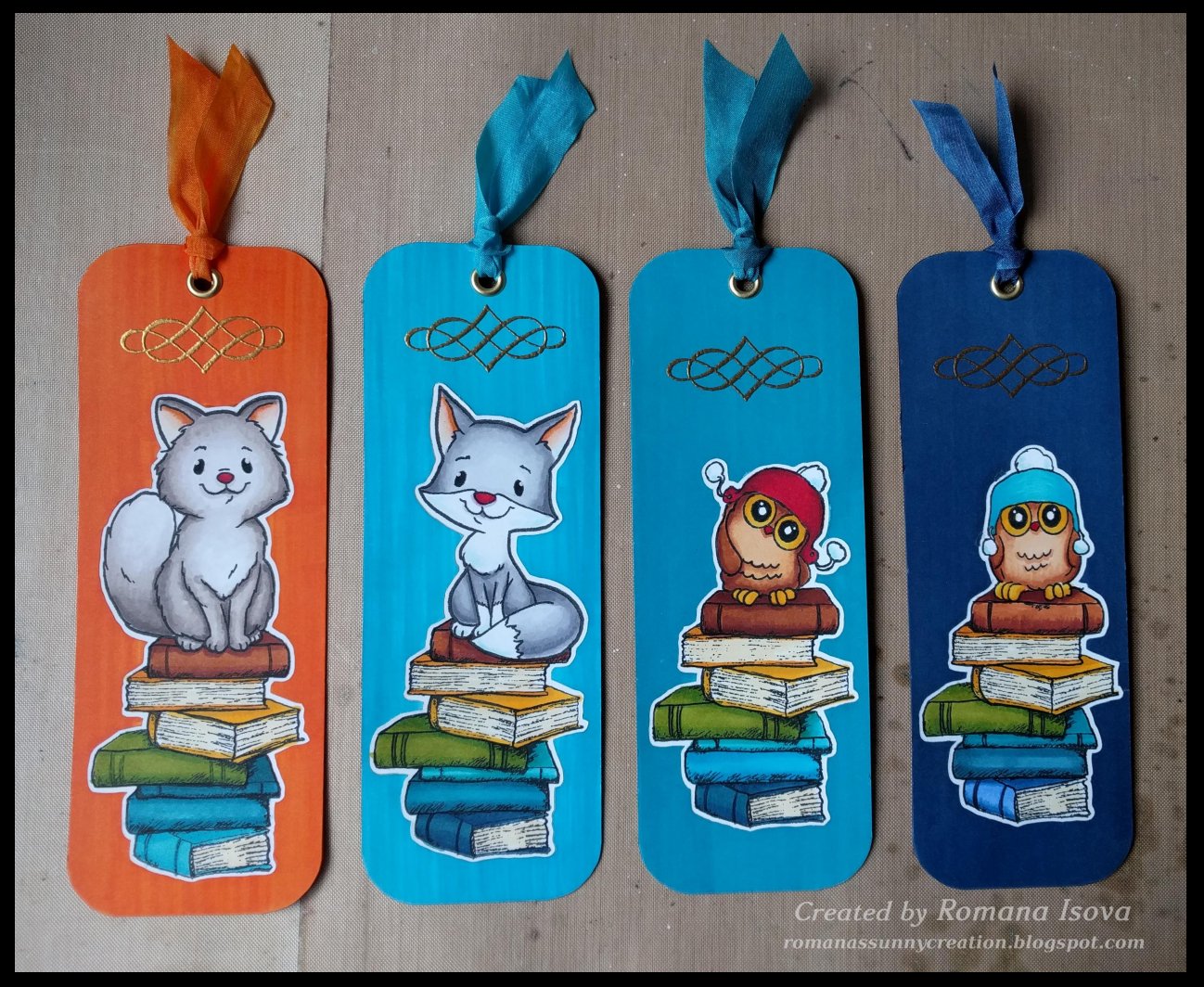
We were invited for a nice Christmas lunch to our friends and I wanted to bring something a little bit more personal to them. I decided for my previous Christmas gift idea and make the special bookmarks, also with a wishes of "Happy year". I thing they turned out very cute :0)

Colored with alcohol markers, embossed with Wow! Metallic gold rich pale embossing powder and gilded with double sided tape stripes and gold foil from Prima. Text stamped with great "Perfectly penned" alphabet stamp set from Concord & 9th. White ribbon colored with matching alcohol markers.


2016 Christmas cards

Christmas cards for 2016...that was quite an adventure :0) Sometimes your idea seems to be easy and then, during a realization itself, you find out that things go wrong or at least other way than you've imagined. So you change your plans and start again and leave this part and add another....and at the end there is the day when you really need to finished it all and send all your best wishes to your beloved as soon as possible. So you focus hard to make the cards almost perfect...during the morning, during the day, during the afternoon and evening and even the night...and at 6:30 a.m. you decide not to go to bed at all and keep your eyes open even a while longer so you can go to the post office after they open :0))
But i think it was worth it and I'm very happy that this year I also included a small gift for everybody - the bookcase with wishes of "Happy year" made with love, because I think that we all need a happiness in our lives :0)

Embossed white cardstock base colored with archival and distress ink pads plus colour cardstock background embossed with white embossing powder and colored with archival inks / colour cardstock background embossed with clear embossing powder and colored with archival inks.
Medallions: colour and white cardstock colored with distress ink pads, stamping with Ranger Black soot archival ink. Bunnies and trees colored with Distress markers and sealed with Distress micro glaze wax. Silver "mirrored" stars. Dimension to the frames added with white craft foam circles.
Bookmarks: background colored with alcohol markers, bunnies and books with Distress markers sealed with Distress micro glaze. Embossed with Wow! Metallic gold rich pale embossing powder and gilded with double sided tape stripes and gold foil from Prima. Text stamped with great "Perfectly penned" alphabet stamp set from Concord & 9th. White ribbon colored with matching alcohol markers. 

So have a great year 2017 and a lot of happiness in it :0)


Wednesday, 4 May 2016

Playful art journal page 9

Today's journal page is just a simple combination of some elements I wanted to use once. And topic... "Around the world" :0)

Background is made with stamping and Pan pastels again, postal stamps die cuts were embossed with embossing folders with script, travel and postal theme sprayed with Distress inks with some Pan pastels on it for more matte look. A globe is a gorgeous die from Tim Holtz. And than these nice stamps I have from my parcels and letters with crafty things...irresistible :0)

So no special technique today, just a little challenge with grey background...it is really not a color I would use a lot :D Just one funny thing - when I took my photos of this page, if the sunlight came from other side, the embossed parts looked like deeply debossed. Very cool - but not truth :0))

3.5.2016 Playful art journal page 9