Monday 28 August 2017

Stampscape - 5 colourful brayered scenes and one bonus card again

Today's series is five colourful stampscape brayered background cards on ordinary inkjet glossy photo paper and one slightly different bonus card at the end. 

During last week I finished all the remaining cards I had with pre-brayered background. I used Tsukineko Kaleidacolor rainbow dye inkpads in different colour combinations. The colours are bright and bold, although it is not visible on the photos. All their shades are just beautiful, but I found out, that every device shows them differently, so I really hope, that you can see them in their richness as I do :0)

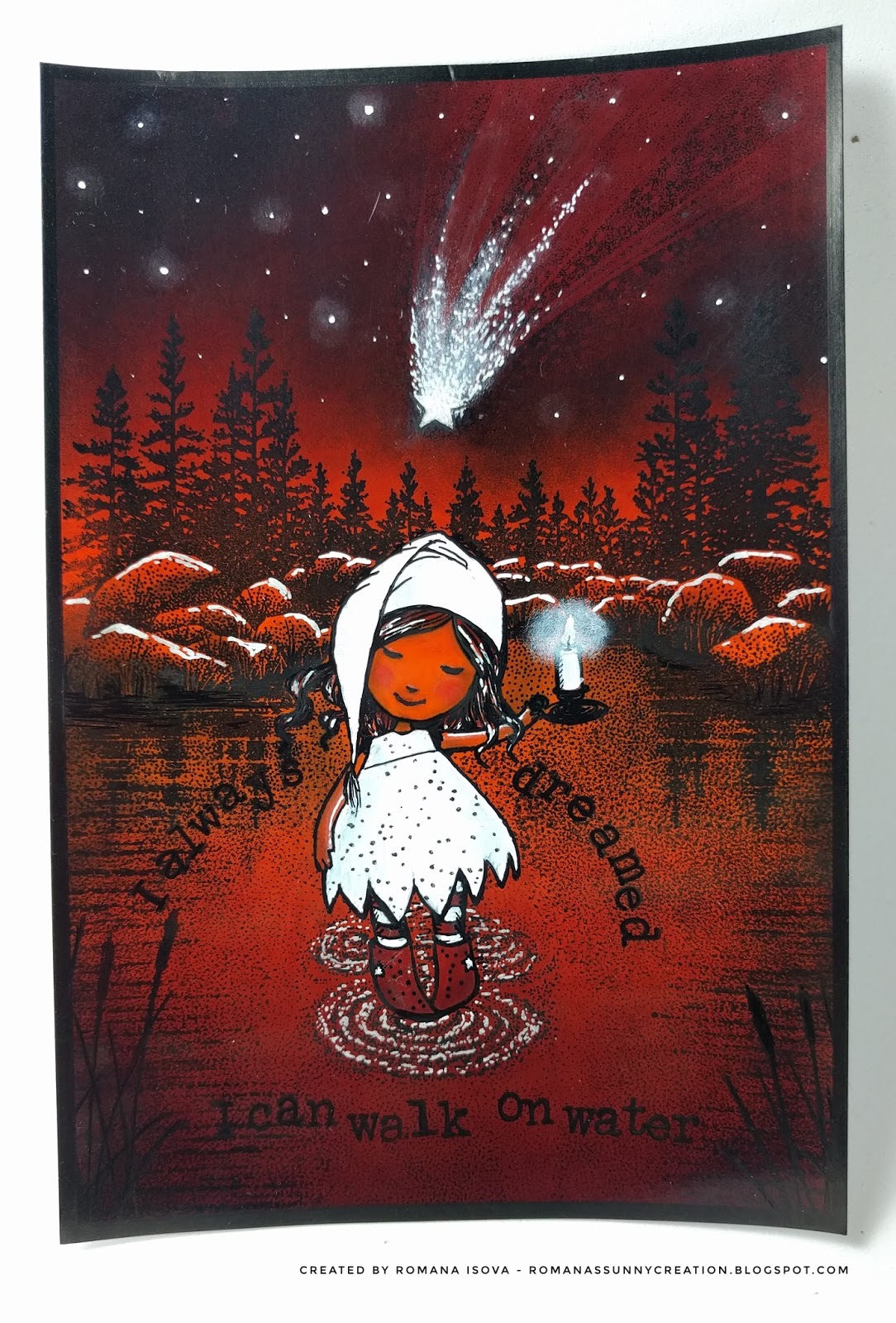
Anyway, these cards are again a combination of traditional Stamscapes stamps and other stamps from my stash and they are built around the quotes on them.

It was a bit tricky to integrate the characters into the scenes and use the only the colours of the backgrounds, just with the help of white gel pen and black liners (only for the snowman I used Posca brush paint pen to achieve really white colour), but I must say that the outcome is better than I hoped and I love how the cards look together :0)

I hope that they will bring at least a little smile to you, thank you for stopping by and here they are, at first together and then individual cards  with a bonus one below:


20.8.2017 Stampscape card - Oh my, it's high


24.8.2017 Stampscape card - Halloween and no moon? Really?


24.8.2017 Stampscape card - Wild ride!


25.8.2017 Stampscape card - Finally holiday!


27.8.2017 Stampscape card - Hide and seek


27.8.2017 Stampscape bonus card - I always dreamed I can walk on water


Friday 18 August 2017

Stampscape - 4 brayered scenes and a bonus scene

Welcome to the jungle, Once upon a midnight dreary, Sea of wonders and Serenity - a moon series of four stampscape cards on ordinary inkjet glossy photo paper, this time with the brayered backgrounds. 

On an ordinary photo paper is almost impossible to achieve the nice smooth layered background that Kevin Nakagawa shows in his lessons. But it is quite easy to us a brayer and ink pads to cover the entire background of the image with one or more colors. For these new 4 cards I finished this week I used Distress ink pads in a muted tones - Antique linen, Old paper, Ice spruce, Tea dye and Brushed corduroy and I tried to stay with these colors and their combinations till the end of work, just with the addition of black and white. 

These card should be also a mix of Stampscapes stamps and other stamps from my collection to find out how they work together :0)

Because I did not think about these scenes in advance, I let the  final colours of the backgrounds to inspire me, I did not masked my moons, although the moon and the architectural parts are at the end the connecting elements of this card set.
All the moons were stamped separately on the photo paper and collaged on the cards, after I decided about the composition of the images.

For the coloring were used the ink pads and inking tool, but also the Distress markers, although I struggled sometime with smudging, because these dye based markers were so wet that they smeared the images stamped with black Memento ink or black Tombow marker I applied directly to the stamps to achieve a deep black and crisp images on this photo paper (Tombow marker and black Sharpie paint pen were also use for overpainting where the black was not black enough and white gel pen, Sharpie paint pen and white pigment ink pad for the lights).

On the other hand due this smudging there are some interesting effects and I also discovered how interesting could be to use a clear Tombow marker on this paper  :0)

I like this cards, this kind of monochromatic stamping is a completely new animal to me and I enjoyed every moment and every challenge that has arisen before me during their creation. My favourite is a Sea of wonders, but for you it could be of course another one...if you want, let me know which one it would be :0)

And this set has also a bonus card - Around the world. This card started in a same way as others, but for the coloring I used also my alcohol markers. They don't smudge the stamped images at all so the final colors of this card are much brighter. Alcohol markers also glides a bit on the photo paper leaving an effect on the background again. Therefore this piece is a bit different and does not fit completely to this series.

Thank you for stopping by and hopefully see you next time again :0)


17.8.2017 Stampscape cards - Welcome to the jungle, Once upon a midnight dreary, Sea of wonders, Serenity...


17.8.2017 Stampscape bonus card - Around the world


Stampscape - how to save a scene

This stampscape on ordinary inkjet glossy photo paper is an example how can be saved a card which seemed to be a complete disaster :0)

After my first 4 stampscape scenes which started as a background and test of the paper options - I wanted to try a reverse technique. I started with a black ink stamping. Unfortunately I overstamped my card, so the foreground was too dark and there was no space for the lighter spots, whole card was tooo black and definitely was not a seamlessly stamped. Then I started with coloring - a day scene with blue sky and water, grey mountains and rocks and green woods etc. But the colors did not match together at all, overstamping was still visible and everything looked too flat :0(

In that moment I decided to change a day scene to a night scene. If the card is already so dark, it could be even darker and without green trees - I over-painted them in black - the blue tones united all the card. And there was a great space for darker tones and of course great white highlights - the light coming from the rising moon which I made with a gel pen, a Sharpie paint pen and white pigment ink and the cotton buds. 

Final result is not perfect at all, but believe me, it is much much better than at the beginning. So my conclusion is, that it is not necessary to throw away the scenes you don't like, but you can always try to continue to work on them and at the end, the result may even pleasantly surprise you :0)

11.8.2017 Stampscape scene - No such a disaster


Tuesday 8 August 2017

Stampscape cards - first 4 scenes

Four stampscape cards on ordinary inkjet glossy photo paper (tropical card and ducks card), Ranger specialty matt coated paper (bats card) and Ranger glossy paper (blue lake card).

Because I don't have the great paper Kevin Nakagawa use in his video lessons, these cards started as a paper test for different papers I have in my stash - how easily or hardly they take the dye inks. Then I decided to use them also for stamping. The scenes were stamped with Memento Tuxedo black ink and/or Ranger Black soot archival ink.

It was not too easy I need to say, because on all of them the ink dries pretty quickly, so it is not easy to achieve nice blends of colors as Kevin does. I found out, that Versamark ink is a very helpful, especially for inkjet photo paper, because as a first  clear layer it fill the paper a bit and helps to other inks to stay longer on the surface of the paper so they can be moved and mixed better.

When the ink layers were dry (I used a heat tool) I stamped the scenes in black colors. Unfortunately even if I tried, none of the images was stamped perfectly solid and opaque and drying with my heat tool also did not helped - somehow it caused that black become a quite dull. So I used black Pigma Micron pens and Memento marker to fill the gaps and make black more black again :0).  For white details I used a white Sakura gelly roll pen. It works perfectly. And the clouds on the green card were just painted with a white Pitt artist pen (India ink) and just smudged with fingers before they dry completely (also this ink dries fast).

Next time I will definitely try a reverse order - first stamping and then coloring. But I thing that these cards was an experiment and I learned a lot, so the goal was achieved :0)

And here they are, 4 cards, 4 scenes and 4 moods... Thank you for stopping by, have a nice day and I'll be glad when you let me know which card do you like the most :0)...

6.8.2017 Stampscape cards - Tropical sunset, Blue lake, Duck rest and Night of bats...


Wednesday 2 August 2017

Stampscape art journal page - Starlight

Starlight- art journal page in Canson Mix Media middle art book - 17 x 25 cm (cca 6.5" x 10")


A long time ago I discovered the art of scenic stamping, when I found the youtube educational videos of Stampscapes.com. I believe that a scenic stamping is not anything new in the creative world, but Kevin Nakagawa's style is beautiful and inspiring, based on his own line of detailed stamps which can be use for "seamless" stamped scenes and I really recommend to visit his page. 

Recently I decided to buy some of his stamps and here is my first attempt with this technique :0) I used Distress and Memento inks,  Distress markers, white gel pen and black liner pens. 

1.8.2017 Stampscape 1 - Starlight