Showing posts with label Stampscapes. Show all posts

Monday, 19 September 2022

Art journal page - Destiny

Hi and welcome to my blog. Today I have a bigger page - 8"x10" (ca 21 x 25 cm). 

For this page I combined Stampscapes stamps with randomly picked stamps from my stash e.g IndigoBlu unicorn (the second unicorn was created with mirror-stamping technique on the gel plate). I used Distress oxide colours for my background and Distress inks to color my images. I enhanced the details and lines with black Ohuhu Water-based marker and black and white acrylic paint pens. For my main focal points I've chosen Carabelle studio girl stamp and also texture plate with the beautiful astrological circle. 

Thank you for your visit and have a great creative time :0)

19.9.2022 Destiny


Sunday, 19 November 2017

Creative weekend 9 - "Spooky night"

Spooky night art journal page is a test of a new Dorée paper pad with slightly creamy 20x20 cm (ca 8"x8") papers. 
It is a drawing and sketching pad, but I wanted to try how this paper will work with some of the creative media I normally use in my art journals - Distress inks with water droplets, paint pens, coloured pencils, Pitt brush pens with India ink and even clear gesso and pastel ground medium.

The outcome is not bad, although it is necessary to be careful and don't rub the surface when it is wet, because it damages the paper. But otherwise I'm quite satisfied, the paper is only 170 gsm (115 lb), tu is sturdy enough to work with, although it would be probably not good to use a lot of spray inks or so. 

So as I said, I used Distress inks with water droplets technique for the background and white Distress ink with a spiderweb stencil over it. Then I used stone wall stencil for the foreground and Stampscapes trees, Inkadinkado owl, Penny Black pumpkins and Chocolate baroque cauldron stamps. Bat is a part of the another, Halloween, stencil from Tim Holtz. 

I played a lot with the pumpkins. I wanted to colour them directly over the background colours, so I used Luminance coloured pencils, but the final colours were not so bright I wanted, so I covered all the pumpkins with a beige pastel ground medium, which creates more tooth to hold the pencils better. It helped, but not so much I hoped, so I added another layer over them with a clear gesso and over this final, now non porous, surface I used Pitt brush pens which are filled with permanent India inks. Finally I rubbed some colours of with a cotton swab as my highlights. Owl is quite dark, so she was coloured directly with Pitt pens over the surface. As a final layer for her eyes I used glitter gel pen and the same pen I also used for some details on the page. Moon and a steam from the cauldron were coloured with white paint pen, bats with a black Pitt pen through the stencil. 

Thank you for stopping by again, have a nice Sunday evening and see you later :0)


18.11.2017 Spooky night


Sunday, 12 November 2017

Creative week 13 - Stampscape art journal - Dreaming about an adventure


Hi, welcome back today :0)

Dreaming about an adventure - is a partially stampscape art journal page from my Seawhite hardbound 7.5"x7.5" (ca. 20x20 cm) journal.

I started with a new Dylusions paints - Rose quartz, Peony blush, Laidback lilac and Periwinkle blue - on the background and then used black Dylusions paint with an older The Crafter's workshop stencil with a very nice pattern.

Then I created my black-and-white stampscape with a few of Stampscapes stamps and "hung" it on my background "wall" :0)

Finally I stamped the cactus stamp set from Carabelle studio and girl from Stampendous and coloured them with Dylusions sprays. She is my dreamer, she's sitting in the middle of her beloved cactuses and thinking about an adventure - how it would be to visit the land on the picture :0)

Funny is, that I prepared every part of this art journal sooo carefully and then I glued my stampscape on the background in a wrong direction than I wanted...ha ha ha....so for the next time: "Don't use a strong double sided tape, but always a liquid glue, so the mistake can be fixed!" :D

Anyway, I think that sometimes we all have dreams like this...so let's make our dreams come through :0)


10.11.2017 Dreaming about an adventure


Tuesday, 12 September 2017

Creative week 9 - Stampscape art journal - Golden Stars of California

Hi, welcome back :0)

Today's art journal page - Golden Stars of California - is a scenic jump into my Seawhite hardbound 7.5"x7.5" (ca. 20x20 cm) journal.


Again it is a mixed scene with Stampscape stamps and other stamps from my stash. When I saw a cine camera stamp and a desert scene from Stampendous, it reminded me immediately California and its movie stars :0) 

So here it is, a simple journal page stamped in black and coloured with a few Distres ink pads and white paint pen...and of course with golden stars projected by the cine camera on the California's night sky. I embossed them with Ranger Gold tinsel embossing powder and then I cut out the letters from a gold washi tape (I stuck the tape on the stripes of a wax paper, so I can then remove my "letter stickers" from it easily). To unify the different golden shades of the powder and the tape I used an yellow ochre alcohol marker which can be used on the non-porous surfaces. As a finishing touch I added a film strip die cut as my thematic label. 

This journal page is my entry for Simon Say Stamp Monday challenge "It's written in the stars".


12.9.2017 Golden Stars of California


Saturday, 9 September 2017

Stampscape art journal - SPACE A-LIVE

I have one more post today, an Stampscape art journal page SPACE A-LIVE on Clairefontaine Paint On Multi-Techniques paper  (250 gsm / 115 lb and ca 21x30 cm / 8"x12"). 
For the elements on the page I used Canson Bristol smooth paper (260 gsm/ 100 lb and ca 23 x 30,5 cm / 9" x 12"). Surprisingly is this paper is very sturdy and it's easy to work with if you need to cut out something even quite small as my astronauts so I don't afraid to make my them dimensional. 

Actually I was experimented with sprayed colours and wrapped kitchen foil technique. I used Distress sprays colours let them mix on the paper and put the kitchen foil over the page, made a wrinkles and let it dry with foil on it over night. When I removed the foil I found a very nice texture effect. I made two backgrounds like this, lighter and darker and for this page I used the darker one, because it evoked me the space. 

This scene is actually a broadcasting of the TV - a SPACE A-LIVE channel and the astronauts are the reporters recording the encounter with the giant space fish species :0)

Although I used just a few stamps from Stampscape Spacemen set  (asteroids belt and astronauts) I include this page into my stampscapes, because still, it is a scene right? :0) 

I used my Misti tool and Marvy and Tombow markers to colorfully stamp the shadow-stamp fish from Local King rubber stamps and Memento inks and Caran d'Ache Luminance coloured pencils for the bigger asteroids. Beside my main white stars I used also a silver glitter Gelly Roll pen from Sakura for a smaller star dots. They are very subtle, but they nicely complete the page. Unfortunately they are not much visible on the main picture so I enclose another one from the angle so you can see them better

This page is also my entry for both of the Simon Say Stamp Stamptember challenges - Monday challenge "Stamp It" and also the Wednesday challenge with the same name :0)

I hope you like this page as I do, thank you for stopping by and see you next time :0)


8.9.2017 Stampscape art journal - SPACE A-LIVE


Stampscape - sealing the scene

This post is just a short notice about the sealing of the scene stamped on the glossy cardstock. 

When I do a Stampscape scene on a regular glossy cardstock mostly I have the problem with final intensity of the colours. It does not matter what brand of the ink pad I use for the colouring of the scene (Distress, Memento, Hero arts inks etc.), at the end the cardstock changes them somehow and the colours become quite dull. Only exception seem to be thinner Marvy inks, I bought recently, but with those I did not experiment enough yet :0) 
Kevin Nakagawa of Stampscapes stamps recommend to put a good  layer of lightest thicker ink first, so every other layer of the thicker or thinner inks will slide more easily on the surface of the card and the application will be much smoother. He says that if your first layer is juicy enough, the other colours will stay much more vibrant at the end...

But sometimes the cardstock is pretty stubborn and nothing helps, so he also recommend to use spray sealers at the end to bring back the colours vibrancy. I don't like these sprays, the smell is not good and they are not very environmentally friendly, I think. 

Fortunatelly recently I found the great solution. I found somewhere that the sealers like micro glaze from Ranger or JudiKins should work. And it is totally true. They are basically the clear waxes, so I think that any other craft waxes like Shabby from ToDo could be used also. After you finish all your work, just apply the thin layer of these products on the card with a cotton cloth or your fingers and the colours are back and your black is dark again :D. And if you apply it gently and don't rub too hard, even the white gel pen highlights will stay untouched, but sealed on your art piece  :0)

Here is just one card I made as a test. And maybe this article could help you with the decision whether and how to seal your scenes on glossy cardstock if you are not totally satisfied with the outcome :0)

Have a nice day and see you next time :0)

30.8.2017 Stampscape Ranger Microglaze sealed landscape


Monday, 28 August 2017

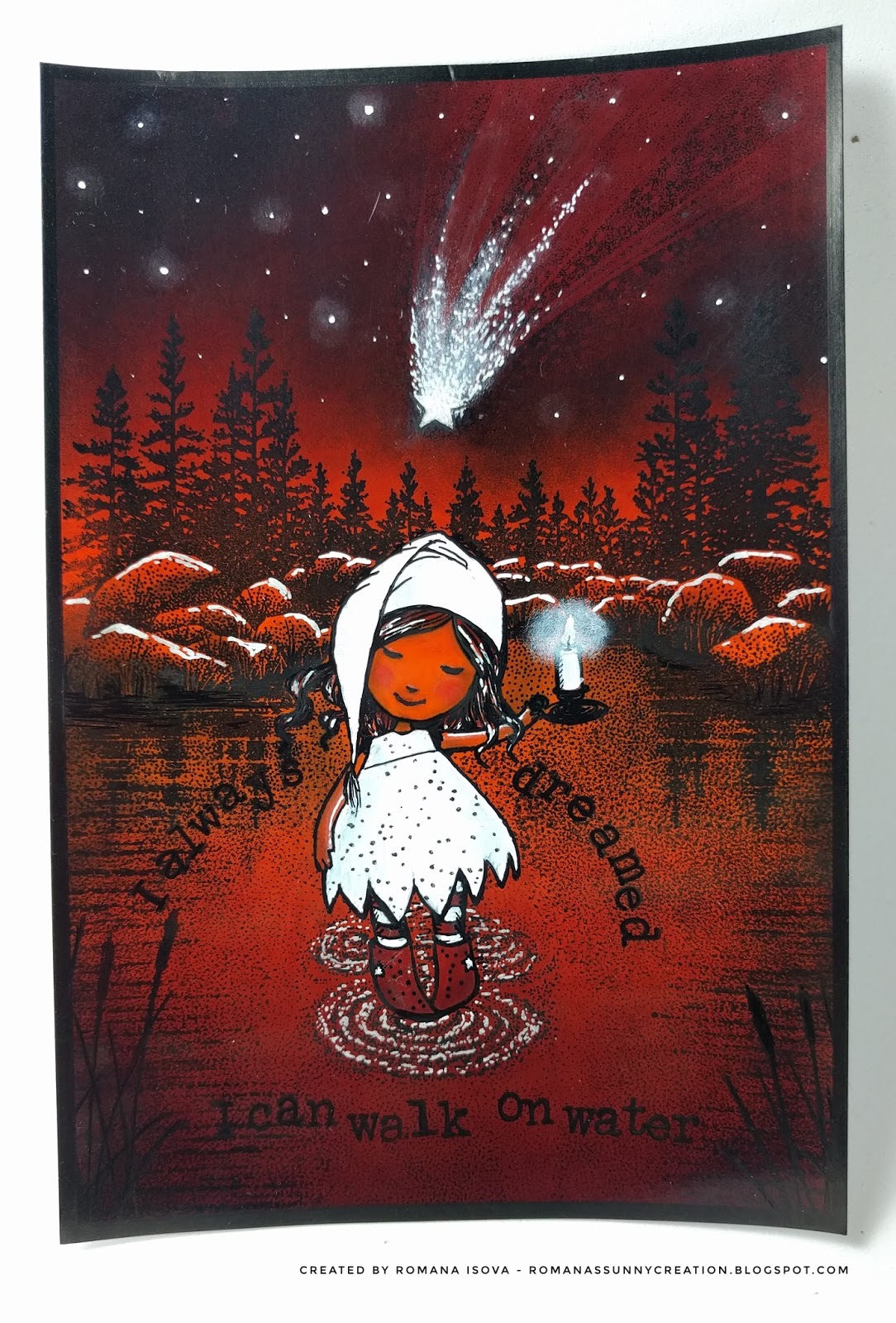
Stampscape - 5 colourful brayered scenes and one bonus card again

Today's series is five colourful stampscape brayered background cards on ordinary inkjet glossy photo paper and one slightly different bonus card at the end. 

During last week I finished all the remaining cards I had with pre-brayered background. I used Tsukineko Kaleidacolor rainbow dye inkpads in different colour combinations. The colours are bright and bold, although it is not visible on the photos. All their shades are just beautiful, but I found out, that every device shows them differently, so I really hope, that you can see them in their richness as I do :0)

Anyway, these cards are again a combination of traditional Stamscapes stamps and other stamps from my stash and they are built around the quotes on them.

It was a bit tricky to integrate the characters into the scenes and use the only the colours of the backgrounds, just with the help of white gel pen and black liners (only for the snowman I used Posca brush paint pen to achieve really white colour), but I must say that the outcome is better than I hoped and I love how the cards look together :0)

I hope that they will bring at least a little smile to you, thank you for stopping by and here they are, at first together and then individual cards  with a bonus one below:


20.8.2017 Stampscape card - Oh my, it's high


24.8.2017 Stampscape card - Halloween and no moon? Really?


24.8.2017 Stampscape card - Wild ride!


25.8.2017 Stampscape card - Finally holiday!


27.8.2017 Stampscape card - Hide and seek


27.8.2017 Stampscape bonus card - I always dreamed I can walk on water


Friday, 18 August 2017

Stampscape - 4 brayered scenes and a bonus scene

Welcome to the jungle, Once upon a midnight dreary, Sea of wonders and Serenity - a moon series of four stampscape cards on ordinary inkjet glossy photo paper, this time with the brayered backgrounds. 

On an ordinary photo paper is almost impossible to achieve the nice smooth layered background that Kevin Nakagawa shows in his lessons. But it is quite easy to us a brayer and ink pads to cover the entire background of the image with one or more colors. For these new 4 cards I finished this week I used Distress ink pads in a muted tones - Antique linen, Old paper, Ice spruce, Tea dye and Brushed corduroy and I tried to stay with these colors and their combinations till the end of work, just with the addition of black and white. 

These card should be also a mix of Stampscapes stamps and other stamps from my collection to find out how they work together :0)

Because I did not think about these scenes in advance, I let the  final colours of the backgrounds to inspire me, I did not masked my moons, although the moon and the architectural parts are at the end the connecting elements of this card set.
All the moons were stamped separately on the photo paper and collaged on the cards, after I decided about the composition of the images.

For the coloring were used the ink pads and inking tool, but also the Distress markers, although I struggled sometime with smudging, because these dye based markers were so wet that they smeared the images stamped with black Memento ink or black Tombow marker I applied directly to the stamps to achieve a deep black and crisp images on this photo paper (Tombow marker and black Sharpie paint pen were also use for overpainting where the black was not black enough and white gel pen, Sharpie paint pen and white pigment ink pad for the lights).

On the other hand due this smudging there are some interesting effects and I also discovered how interesting could be to use a clear Tombow marker on this paper  :0)

I like this cards, this kind of monochromatic stamping is a completely new animal to me and I enjoyed every moment and every challenge that has arisen before me during their creation. My favourite is a Sea of wonders, but for you it could be of course another one...if you want, let me know which one it would be :0)

And this set has also a bonus card - Around the world. This card started in a same way as others, but for the coloring I used also my alcohol markers. They don't smudge the stamped images at all so the final colors of this card are much brighter. Alcohol markers also glides a bit on the photo paper leaving an effect on the background again. Therefore this piece is a bit different and does not fit completely to this series.

Thank you for stopping by and hopefully see you next time again :0)


17.8.2017 Stampscape cards - Welcome to the jungle, Once upon a midnight dreary, Sea of wonders, Serenity...


17.8.2017 Stampscape bonus card - Around the world


Stampscape - how to save a scene

This stampscape on ordinary inkjet glossy photo paper is an example how can be saved a card which seemed to be a complete disaster :0)

After my first 4 stampscape scenes which started as a background and test of the paper options - I wanted to try a reverse technique. I started with a black ink stamping. Unfortunately I overstamped my card, so the foreground was too dark and there was no space for the lighter spots, whole card was tooo black and definitely was not a seamlessly stamped. Then I started with coloring - a day scene with blue sky and water, grey mountains and rocks and green woods etc. But the colors did not match together at all, overstamping was still visible and everything looked too flat :0(

In that moment I decided to change a day scene to a night scene. If the card is already so dark, it could be even darker and without green trees - I over-painted them in black - the blue tones united all the card. And there was a great space for darker tones and of course great white highlights - the light coming from the rising moon which I made with a gel pen, a Sharpie paint pen and white pigment ink and the cotton buds. 

Final result is not perfect at all, but believe me, it is much much better than at the beginning. So my conclusion is, that it is not necessary to throw away the scenes you don't like, but you can always try to continue to work on them and at the end, the result may even pleasantly surprise you :0)

11.8.2017 Stampscape scene - No such a disaster


Tuesday, 8 August 2017

Stampscape cards - first 4 scenes

Four stampscape cards on ordinary inkjet glossy photo paper (tropical card and ducks card), Ranger specialty matt coated paper (bats card) and Ranger glossy paper (blue lake card).

Because I don't have the great paper Kevin Nakagawa use in his video lessons, these cards started as a paper test for different papers I have in my stash - how easily or hardly they take the dye inks. Then I decided to use them also for stamping. The scenes were stamped with Memento Tuxedo black ink and/or Ranger Black soot archival ink.

It was not too easy I need to say, because on all of them the ink dries pretty quickly, so it is not easy to achieve nice blends of colors as Kevin does. I found out, that Versamark ink is a very helpful, especially for inkjet photo paper, because as a first  clear layer it fill the paper a bit and helps to other inks to stay longer on the surface of the paper so they can be moved and mixed better.

When the ink layers were dry (I used a heat tool) I stamped the scenes in black colors. Unfortunately even if I tried, none of the images was stamped perfectly solid and opaque and drying with my heat tool also did not helped - somehow it caused that black become a quite dull. So I used black Pigma Micron pens and Memento marker to fill the gaps and make black more black again :0).  For white details I used a white Sakura gelly roll pen. It works perfectly. And the clouds on the green card were just painted with a white Pitt artist pen (India ink) and just smudged with fingers before they dry completely (also this ink dries fast).

Next time I will definitely try a reverse order - first stamping and then coloring. But I thing that these cards was an experiment and I learned a lot, so the goal was achieved :0)

And here they are, 4 cards, 4 scenes and 4 moods... Thank you for stopping by, have a nice day and I'll be glad when you let me know which card do you like the most :0)...

6.8.2017 Stampscape cards - Tropical sunset, Blue lake, Duck rest and Night of bats...


Wednesday, 2 August 2017

Stampscape art journal page - Starlight

Starlight- art journal page in Canson Mix Media middle art book - 17 x 25 cm (cca 6.5" x 10")


A long time ago I discovered the art of scenic stamping, when I found the youtube educational videos of Stampscapes.com. I believe that a scenic stamping is not anything new in the creative world, but Kevin Nakagawa's style is beautiful and inspiring, based on his own line of detailed stamps which can be use for "seamless" stamped scenes and I really recommend to visit his page. 

Recently I decided to buy some of his stamps and here is my first attempt with this technique :0) I used Distress and Memento inks,  Distress markers, white gel pen and black liner pens. 

1.8.2017 Stampscape 1 - Starlight