Showing posts with label Chocolate Baroque. Show all posts

Friday, 15 September 2023

Art journal page - Beautiful

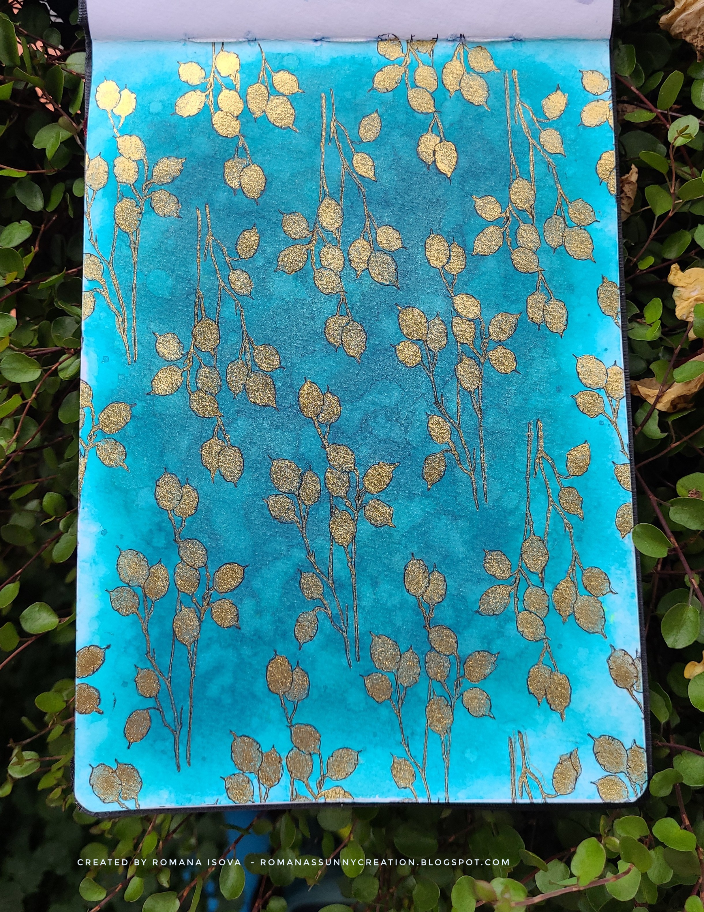
Hi :0) I have another 6"x8" (cca 15x20 cm) art journal page in Hahnemühle journal book. This one is my entry for Simon Says Stamp's Wednesday challenge Make it Cute.

I'm still in Lindy's magical shakers so today's background is a mix of Lizzy's Cuppa Tea Teal and Spill the Tea Teal with a few layers of water droplets to create a texture. I stamped all page with this nice leaves stamp from Chocolate Baroque, coloured all images with Winsor and Newton Gold drawing ink and I re-draw everything with 003 Pigma Micron liner. I love this background and it was very hard for me to "covered" it with other images :D

I cut the window from semi-black mirrored cardstock with the die from Tim Holtz, scratched it with a sand paper and re-painted with black archival ink and black acrylic pen. Night sky is a mix of the same shakers I used for the background, this time with much more of Spill the Tea Teal. This "blue" shaker colour is a real beauty :0) 

I die-cut the moon with a moon die from Whimsy Stamps and coloured with the WN Gold ink. The same one I used also for the stars. Whimsy Stamps's robots are stamped on silver cardstock from TH, scratched a bit and over-painted with a clear gesso to dull the shine and add the texture for colouring. I coloured them with black archival ink, Gold ink and magical shakers. Than I re-defined the lines with black acrylic paint pen and fixed the images with acrylic liquid medium. At the end I added a stripe from mirrored cardstock and a quote label from Simple Stories. 

Thank you for your visit, feel free to leave me a comment and have a very nice Friday :0)


14.9.2023 Beautiful


Sunday, 11 November 2018

Creative week 17 - "It doesn't have to be Halloween"

Hi and thank you for your visit again :0). As I promised last time, here is a new art journal page from my Seawhite hardbound 7.5"x7.5" (ca. 20x20 cm) journal. 

I think that Halloween is not the only day or night when witches make their magic. I had this idea in my head for some time , so I'm very happy with the final page :0). Especially because of the alcohol markers colouring I did this time - it is really not my cup of tea .0). I used ShinHan Touch Twin alcohol markers and Spectrum Noir alcohol markers together with white and black gel pens. 

I stamped all my images from an awesome "Witch way is the candy" stamp set from My Favorite Things (just the nice broom is from Chocolate baroque) with Memento Tuxedo black ink pad and enhanced the black lines after colouring with Memento Tuxedo black marker. 
Background is a combination of Distress sprays - Seedless preserves, Faded jeans and Chipped sapphire - and water. For white droplets I used white gesso mixed with water. The more is the gesso diluted, the more the droplets obtain the colour of the background from Distress sprays before they dry, so the white of the gesso is not so shiny at the end. It is also possible to use the same colours of Distress inks over the dried page and muted the white dots with them as I did. 

This page is also my entry to the Simon Says Stamp Monday challenge.

Thank you for your visit and see you next time :0)


10.11.2018 It doesn't have to be Halloween

Tuesday, 6 November 2018

Creative week 16 - "Awesome AUTUMN beauty"

Hi and thank you for your visit :0). I'm back again with an art journal page from my Seawhite hardbound 7.5"x7.5" (ca. 20x20 cm) journal. 

This time I was strongly inspired by the last beautiful. sunny, warm and colourful autumn days we had here in a past few weeks. It was just awesome go out, watch the leaves in their transformation and be surprised by the nature life everywhere around - birds, fish, insects (e.g. ladybug flying around me which found its place on the page) - although we could say that winter is almost here, just around the corner :0)

Background was created with a combination of blue Distress inks and Distress oxides which I like a lot  (Distress wet on dry layers basic background technique). In reality are the colours much darker, and deeper, with an awesome contrast and final effect. Die-cuted leaves, ladybug and pumpkin were also coloured with Distress inks. For a pumpkin which I drew myself I used also Distress markers to achieve darker shading. At the end I used Nuvo Crystal glaze on the ladybug and a peace of natural corrugated paper - stained with Distress inks and sprayed with water - as my ground (it is not much visible, but it really fits there) :0)

This page is also my entry to the Simon Says Stamp Wednesday challenge. 

And it is for today. I hope I will be back soon with another page. Thank you for your visit and if you would like to come again, see you next time :0)

04.11.2018 Awesome AUTUMN beauty


Sunday, 19 November 2017

Creative weekend 9 - "Spooky night"

Spooky night art journal page is a test of a new Dorée paper pad with slightly creamy 20x20 cm (ca 8"x8") papers. 
It is a drawing and sketching pad, but I wanted to try how this paper will work with some of the creative media I normally use in my art journals - Distress inks with water droplets, paint pens, coloured pencils, Pitt brush pens with India ink and even clear gesso and pastel ground medium.

The outcome is not bad, although it is necessary to be careful and don't rub the surface when it is wet, because it damages the paper. But otherwise I'm quite satisfied, the paper is only 170 gsm (115 lb), tu is sturdy enough to work with, although it would be probably not good to use a lot of spray inks or so. 

So as I said, I used Distress inks with water droplets technique for the background and white Distress ink with a spiderweb stencil over it. Then I used stone wall stencil for the foreground and Stampscapes trees, Inkadinkado owl, Penny Black pumpkins and Chocolate baroque cauldron stamps. Bat is a part of the another, Halloween, stencil from Tim Holtz. 

I played a lot with the pumpkins. I wanted to colour them directly over the background colours, so I used Luminance coloured pencils, but the final colours were not so bright I wanted, so I covered all the pumpkins with a beige pastel ground medium, which creates more tooth to hold the pencils better. It helped, but not so much I hoped, so I added another layer over them with a clear gesso and over this final, now non porous, surface I used Pitt brush pens which are filled with permanent India inks. Finally I rubbed some colours of with a cotton swab as my highlights. Owl is quite dark, so she was coloured directly with Pitt pens over the surface. As a final layer for her eyes I used glitter gel pen and the same pen I also used for some details on the page. Moon and a steam from the cauldron were coloured with white paint pen, bats with a black Pitt pen through the stencil. 

Thank you for stopping by again, have a nice Sunday evening and see you later :0)


18.11.2017 Spooky night


Thursday, 16 November 2017

Art journal page - Autumnal stories

Hi and welcome back :0)

It's been a long time when I created a large square 28 x 28 cm (cca 11" x 11") art journal page. But I had this awesome poster picture of a vintage typewriter and recently I received a real similar writing machine - so the inspiration for this page is quite obvious, I think :0) 

I used one of my heavy weight pattern papers for the background and then I played quite a while with the rowan berries. I found the way how to coloured them on the dark and a bit rough surface. First I stamped them with Versafine, then I coloured every berry with two layers of white Uni posca paint pen and then with alcohol markers till I was happy with the result. At the end I re-defined the berries with a black liner pen.
After that I stamped multiple layers of script stamps using the paper-masking technique and finished the page with typewriter and the typewriter alphabet stamps I like a lot :0) Aaaand that's it - easy page, but a lot of pleasure for me :0)

Thank you for stopping by, have a very nice day and enjoy your crafting moments :0)


15.11.2017 Autumnal stories


Friday, 6 October 2017

Creative week 10 - "Lady in Roses"

Hi, welcome back again :0)

Lady in Roses, today's art journal page is one layer stamped page from my Seawhite hardbound 7.5"x7.5" (ca. 20x20 cm) journal. I chose randomly a few stamps from my stash and combined them into the page. Because I mostly think a lot about my pages, most of them are "story telling" ones, this was a bit challenging, but mostly very freeing :0) The colour combination is also a bit unusual for me, but I like, but surprisingly for me, I like how they work together.

This page would be in my journal normally, but since last page - Golden Stars of California - I decided to enjoy more of the creative freedom and I unbounded my journal completely into a separate pages. It was sooooo relaxing... and this way I can use all the media I want without any boundaries :D Of course, I kept the cover of the journal and all the finished and unfinished pages are stored in it... so I think I can still call it " a journal book" .o)


So I used black Versamark and Ranger Dye ink, stamps from Paper Artsy and Chocolate baroque and Harlequin stencil from Tim Holtz as a background, together with Distress inks and markers, Caran D'Ache Neocolor II water soluble pastels  and Marvy Uchida markers for colouring. To enhance the look of the stained glass I also applied Distress micro glaze on the image of the lady, so the colours are brighter and "shine" a bit more from the rest of the page.

Enjoy the day and see you next time :0)

05.10.2017 Lady in Roses


Friday, 18 August 2017

Stampscape - 4 brayered scenes and a bonus scene

Welcome to the jungle, Once upon a midnight dreary, Sea of wonders and Serenity - a moon series of four stampscape cards on ordinary inkjet glossy photo paper, this time with the brayered backgrounds. 

On an ordinary photo paper is almost impossible to achieve the nice smooth layered background that Kevin Nakagawa shows in his lessons. But it is quite easy to us a brayer and ink pads to cover the entire background of the image with one or more colors. For these new 4 cards I finished this week I used Distress ink pads in a muted tones - Antique linen, Old paper, Ice spruce, Tea dye and Brushed corduroy and I tried to stay with these colors and their combinations till the end of work, just with the addition of black and white. 

These card should be also a mix of Stampscapes stamps and other stamps from my collection to find out how they work together :0)

Because I did not think about these scenes in advance, I let the  final colours of the backgrounds to inspire me, I did not masked my moons, although the moon and the architectural parts are at the end the connecting elements of this card set.
All the moons were stamped separately on the photo paper and collaged on the cards, after I decided about the composition of the images.

For the coloring were used the ink pads and inking tool, but also the Distress markers, although I struggled sometime with smudging, because these dye based markers were so wet that they smeared the images stamped with black Memento ink or black Tombow marker I applied directly to the stamps to achieve a deep black and crisp images on this photo paper (Tombow marker and black Sharpie paint pen were also use for overpainting where the black was not black enough and white gel pen, Sharpie paint pen and white pigment ink pad for the lights).

On the other hand due this smudging there are some interesting effects and I also discovered how interesting could be to use a clear Tombow marker on this paper  :0)

I like this cards, this kind of monochromatic stamping is a completely new animal to me and I enjoyed every moment and every challenge that has arisen before me during their creation. My favourite is a Sea of wonders, but for you it could be of course another one...if you want, let me know which one it would be :0)

And this set has also a bonus card - Around the world. This card started in a same way as others, but for the coloring I used also my alcohol markers. They don't smudge the stamped images at all so the final colors of this card are much brighter. Alcohol markers also glides a bit on the photo paper leaving an effect on the background again. Therefore this piece is a bit different and does not fit completely to this series.

Thank you for stopping by and hopefully see you next time again :0)


17.8.2017 Stampscape cards - Welcome to the jungle, Once upon a midnight dreary, Sea of wonders, Serenity...


17.8.2017 Stampscape bonus card - Around the world


Saturday, 8 July 2017

Art journal page with photo tutorial - Two worlds (entry for Chocolate baroque Spring art competition 2017)

Today I want to show you my entry for Chocolate baroque Spring art competition 2017 - art journal page Two worlds (square 29 x 29 cm / cca 11,5" x 11,5").

This page is about the meeting of two worlds - on and under the surface - when the sea creatures discovered something unusual for them - the boat in the bottle sunk on the ocean bottom :0)

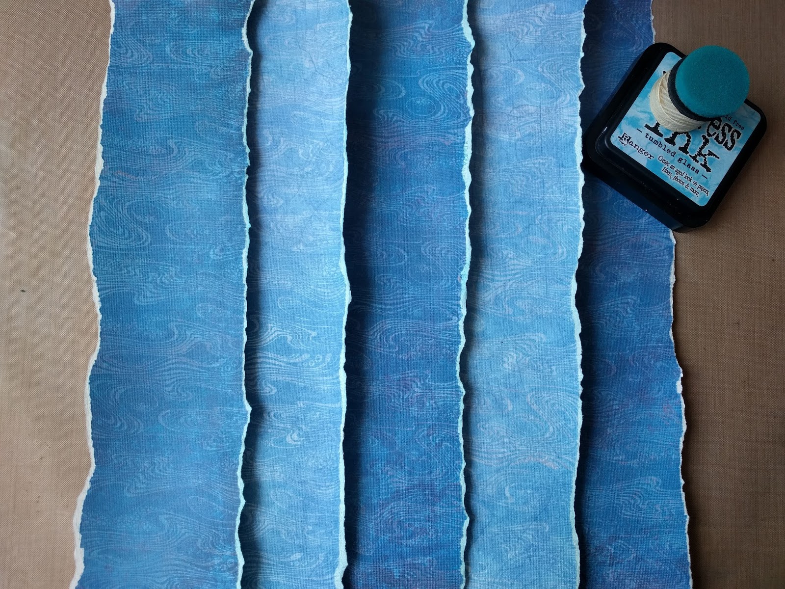
I used two patterned papers and changed them with the use of stamping resist with acrylic glazing medium and a few blue colors of Distress ink pads to reveal the pattern of the stamp and mimic the sun light rays under the water. 
I colored the sea creatures with Distress markers and created the bottle from two layers of acetate sheet. For the stopper I used a piece of selfadhesive cork sheet. 

For the stamping I mixed a few of the Chocolate baroque stamp sets, mainly Steampunk Funky Fish and Steampunk Sea World, a nice flower stamp from October Fairy, coral reef and quote from Seaside Dreams, grass from Awesome orchids, the birds from Landscape Edges, texture from sand from Texture Fragments and finally water texture for background from Harlequin Fragments.  It seems to bee a lot of stamps, but in fact if was not so much and they matched together perfectly :0)

It was a great pleasure and a big fun to use these stamps again an you can find the photo tutorial bellow :0)

Thank you for stopping by, have a nice day and see you next time :0)

14.6. 2017 - Two worlds


1. used stamp sets


2. stamp all the elements


3. cut them out


4. first "how it could be" assemblage...


5. background acrylic medium resist - original papers and the result after stamping, drying and over-coloring with Distress ink. Colors reveal the stamp pattern.
Before stamping I spread a thin layer of the medium on the acetate sheet with a brush and then stamped the stamp into it and on the paper. After finishing is really necessary to clean the stamp  immediately and completely with (soapy) water before the medium will dry on it and ruin it. Medium (wet or dry) is clear an almost invisible on the paper, so only the coloring will reveal it, but the page needs to be completely dry before that.


6. background stripes assemblage. Some parts are over-colored again with Distress ink.


7. background stripes glued together for final layout


8. creating a light rays on the background with darker Distress inks.


9. two acetate sheets cutted in the bottle shape according to the hand made paper template. Upper sheet colored from inner side with grey alcohol markers to create the ilusion of the clear glass.  Bottle stopper cutted from selfadhesive cork sheet and stamped.


10. acetate bottle - first assemblage. The paper waves are torned out from the rest of the background papers. The boat and stopper are between the two acetate sheets.


11. second "how it could be" assemblage...


12. coloring of the elements


13. framing the colored pieces with black alcohol marker. It helps with the dimmension of these pieces on the layout.


14. final assemblage before framing on the white cardstock


15. final art journal page Two worlds :0)


Wednesday, 28 June 2017

Art journal page - I feel great

"I feel great" - art journal page in Canson Mix Media middle art book - 17 x 25 cm (cca 6.5" x 10")

Just a simple page with a mixed Distress inks and Distress oxides background. I used Salty ocean, Mermaid lagoon and Tumbled glass Distress inks - put them on my craft sheet, sprayed with water and dipped the paper in it. Then I layered Broken china and Faded jeans Distress oxides over it with the same technique. As a final layer I used Hero arts Unicorn white pigment ink stamped with the cloud stamps from Katzelkraft. I wanted more natural sky, so I spritzed the page with water and carefully let the pigments mixed horizontally. The final result was very good :0) Nevertheless I used white acrylic gesso to define the top of the clouds more. I also cut the top parts of the clouds from the paper, so I can place my fish also behind them :0)
All these cute fish are from Chocolate baroque steampunk themed stamp sets and I colored them with Tombow Dual brush pens and Distress markers and framed with Faded jeans colour. Finally I added white shading with a colored pencil and Sakura Souffle gel pen.

My quote - a short poem - reflects the feelings of the day and in English could be approximately like this:
"I feel great, it's not a dream,
like a fish in water stream.
What's the water? Who knows it ever?
I might even float in heaven...

Have a very happy day and thanks for stopping by :0)


27. 6. 2017 I feel great


Thursday, 23 February 2017

Art journal page - You can sail and you can fly...

"You can sail and you can fly, under water, in the sky" - another small journal double page from Dylusions journal (cca 20 x 25 cm / 8" x 10").

When I started with my previous journal page (London bridge), I didn't want to waste the beautiful Dylusions inks I sprayed for my background, so I pushed another double journal page against the first one and transferred the excess ink to it. As you can see, these inks are so strong that even this second page is as vibrant as the first one  :0)

So here is again a background with Bubblegum pink, Crushed grape and Calypso teal and some water droplets. I made an easy pattern with Black marble Dylusions paint and two stencils (The Crafter's workshop and Joggles) making also some circles and stamped most of the stamps from a new Layering marble stamp set (Waffle Flower) with Tsukineko Brilliance Platinum planet pigment ink around the page. For more dimension I shaded the circles with Distress Hickory smoke and Picket fence inks.

Stamps (Chocolate baroque boat and Carabelle studio origami birds and fish) are colored with Dylusions inks in waterbrushes. They were cut with white border and glued on a second (slightly bigger) black cardstock layer for more depth. White-silver string was strengthen with mate acrylic medium, so it holds its shape better and a white gel pen was used for highlights. Quote was printed on a small label printer machine.

This page is also my second entry for a Simon Says Stamp new Monday challenge: Transport it which you can visit it here and also the first entry for their Wednesday challenge: Anything goes here.

It seems that it is difficult to stop, when you start to play with Dylusions colors :0)

23. 2. 2017 You can sail and you can fly, under water, in the sky


P.S. ...if you want to see more details, please open the picture (link) in the new tab :0)

Monday, 3 October 2016

Creative weekend 2

Another small page I made this weekend in my new Seawhite hardbound 7.5"x7.5" (ca. 20x20 cm) journal :0) Distress ink pads background, water spraying through stencil, stamping with positive and negative masking and colored pencils incl. white ...

1.10. 2016


Monday, 29 August 2016

Clouterie - Guest Design Team spot for Chocolate Baroque - with photo tutorial :0)

This post is really exciting for me :D. Today I can show you a project I made for Chocolate Baroque stamps as a Guest Design Team member. It's been posted freshly on their Design team blog here.

As a winner of a Spring art competition earlier this year (with a Spring art journal page) I received this great opportunity to make another project with their beautiful stamps. On my blog I would like to show you step by step process, how I created this "textile shop window". And you can find the list of all the materials and colors I used at the end of this blog post :0)


a) first I made a colored paper for a shop window. I sprayed watercolor paper with water, added red Brusho powders and a pinch of blue. Then I used a brush to make a first layer of color. Until I had the final color I wanted, I kept adding the water and red powders and also just a little bit of Brusho Emerald green, because it is an opposite color of the red on the color wheel and make the red more dull. I always moved the brush in the same direction (from right to left and back), so at the end I had a texture resembling the wood grain. After everything was completely dry, I used Lascaux Satin matt acrylic medium as a sealer. I cut the paper into strips, scored them a little bit for the texture, finished the edges with Jet black archival ink and used the double sided tape adhesive tape to connect them into the shop window.


b) then I sprayed my background watercolor paper with water, I added Merlot Color burst powder and with the brush made my base flat color layer (quite pink). I let it air dry, so the final color was more vibrant. After that I stamped background stamp repeatedly with clear Versamark ink on the dry page and than sprinkled the page gently with Merlot Color burst and Prussian blue Brusho powders. With the dry brush I worked the powder into the pattern stamped with Varsamark. Than I sprayed the page with water again and spread the both colors on the page with brush . The stamped pattern remained darker, but it's necessary to be careful with the water (with too much water the dry pattern will be too blur and also with too much powders - they are very intense - the darker will be whole page and the pattern less visible at the end). I trimmed the paper a little bit, so it is slightly narrower than the shop window and can be completely hidden under it.


c) I stamped drapery, carpet, mannequins, corners, shop sign and haberdashery pieces on the mixed media paper with Jet black archival ink and heat set it with my Tim Holtz heat tool, so I could color them with Distress ink pads without smudging. I cut them out and finished all the edges with black waterproof Faber-Castell India ink marker. For the haberdashery I cut out separated masks (from sticky masking tape I stamped the pictures on) for brown and colourful parts, so I could color them safely without mixing the colors. I used Tim Holtz foam applicators and also helpful Tsukineko daubers for smaller pieces. 
For the shadows on the mannequins and all other pieces I used Hickory smoke Distress ink.


Corner stamp I stamped twice and drew a border around both pieces by hand. I colored them with Distress inks and than I lightened up some parts with clean water brush, so they look more dimensional. I wet the areas with water and then removed the excess color with dry paper towel. Left corner is before the and right one after I used the water brush. I am very happy with the wood like look and texture of the corners and the shop sign. It is also thanks to a texture of the Canson paper I used. 

The same lightening process I used on the strawberry patterned violet ribbon (my "carpet steps"). 


And I also decided not to use the thimbles I embossed with silver embossing powder. They would be too contrasting with other elements around.


d) I cut out rectangles from white silk wrapping paper I had from my birthday flowers and I sprayed them with Distress sprays in rainbow colors. I dried it with my heat gun. After that, for every piece I used a darker Distress ink pad color to stamp a patter on it and dry it again. I crumpled he papers several times so it was easier to work with it and arranged it around the mannequins. I used the colored paper ribbons from my stash and stamped buttons to finished the look of the textiles.


e) Finally I completed the page. For more dimensional look I used also a black adhesive fun foam. I used two layers under the shop window and also the drapery and one layer on the back side of the mannequins and lower step of the carpet. So the final layers of the page are - black card stock in the same shape as the shop window as a base for the whole page, violet background patterned paper, one layer of the fun foam frame around the page, upper carpet step directly on the background violet paper and lower carpet step with one layer of the fun foam on the back . Then the mannequins with one layer of the fun foam on the back side and the haberdashery on the upper and lower steps of the carpet. After that the second layer of the fun foam around the page and under the top drapery and on the top of it the corners with shop window and shop sign. 

For bigger parts I used the double sided adhesive tape, but the mannequins stands are glued with Distress collage medium and the haberdashery with Rangers Glossy accents which I also used (in small spots) under the "fabrics".


And here it is - the final project once again:


For the project I used:

Stamp sets from Chocolate baroque:
Floral Mannequins and Haberdashery, Texture Fragments for "textile" patterns, Damask Panel for background pattern and corner stamp from Steampunk Butterfly. 

Colors: 
for the shop window: mix of Brusho watercolor powders - Scarlet, Crimson, Prussian Blue and Emerald green and Color Burst watercolor powder - Merlot, 

for background: mix of Prussian Blue Brusho powder and Merlot Color Burst powder, 

for drapery and carpet: Tim Holtz Distress ink pads Milled lavender, Seedless preserves, Dusty concord, 

for fabrics: Distress ink sprays Spun sugar, Mustard seed, Spiced marmalade, Twisted citron and Tumbled glass and Distress ink pads Milled lavender, Wild honey, Carved pumpkin, Peeled paint and Broken china and for the haberdashery pieces: Distress ink pads in all these colors, 

for brown pieces: Distress ink pad Vintage photo and 

for shading of all pieces: Distress ink pad Hickory smoke. 

Papers: 

slightly textured Hahnemuehle Toscana 90 lbs watercolor paper 24x32 cm for background and shop window, Canson Mix Media 138 lb for all stamped pieces, silk (flower wrapping) paper for "fabrics".


Thank you so much for your patience and support. I really appreciate all your comments and nice words I can read on the Chocolate baroque blog and here :0)


Have a nice week and maybe see you some day with another Guest design team spot :0)


Friday, 8 July 2016

Two birthday cards

Hi :0)

It's been a long time since I posted something new, but I had a few busy weeks - summer has come and it is always travelling and family vacation time :0) So today I would like to show just two birthday cards I made...

Have a nice sunny days and enjoy creating for your relatives :0)

25.5.2016 "Secret garden" birthday card


30.5.2016 "Forest scene" birthday card


Thursday, 19 May 2016

Playful art journal page 12

Obsession, that could be a topic for today's journal page. But the official name is "Halloween again?" ,0)

You probably also know it....sometimes you have an idea, you try to bring it to the life and the final result is....anything else :D. So you try it again (and maybe again and again) :0) That happened to me with last two journal pages. Page 11 was a little bit Halloween, but completely differently then I wanted. And the initial idea in my head was not fulfilled and became a kind of obsession.... That's why I offer you a new page with different point of view :0) Unfortunately I need to admit that even if I love this new page really a lot, the obsession remains :D. Please forgive me, but there will be probably another Halloween page in the future, although it's only May now :D

I'm very proud of this page, because it is 97% one layer page (except of the pumpkins green parts). Normally I would use paper piecing technique, but this time I decided to try it with masks. And it was a lot of thinking about the right order of working steps I must say and paper piecing would be much much easier (but more bulky). Also, I would not worry so much that my next step destroy all the previous work .0) But I think that it was worth it. I love the color combination, shining pumpkins and my cute skeptical owl :0))
There is only one disappointment - my mobile phone camera is not able to take full spectrum of colors. Violet (Distress ink pad Wilted violet) is almost invisible, blues (Distress ink pads Faded jeans and Chipped sapphire) are faded and orange color of pumpkins (Distress ink sprays Fossilized amber and Carved pumpkin) is too dark, even in the sunlight. I spent a lot of time just with taking pictures of this page and I unhappily think that this photo is the best I can make with it....

But I used Distress ink pads and sprays, alcohol markers and for the first time in my crafting history colored pencils also. I learned how to make darker orange color for shading of the pumpkins (according the color theory I mixed orange Carved pumpkin and it's opposite color Wilted violet, so I received darker, muted, but still very nice color), I successfully used colored pencils (and I will use them again) and I made my own masks for each object.... hurray :0)

Please enjoy this page with me and have a very nice day :0)


19.5.2016 Playful art journal page 12


Tuesday, 17 May 2016

Playful art journal page 11

Today a slightly different page - with a little bit more painterly look. Although it was not intended to be like this, I learned a lot with this page - especially about "how important sealing the layers" is :0)

This page started light blue - I wanted to use Faber-Castells gelatos, but I was not completely satisfied with the intensity of colors. So I dried this first layer and used Distress inks over it in two shades of violet - Seedless preserve and Wilted violet. I used "halloween" stencils and moved the page into a little bit "darker" mood. Than I painted a moon, stamped the crows etc.... The page was almost finished and everything was good as long as I decided to make a final sealing of whole page with clear gesso, because without it I was not able to achieve pure white color of the birds and feathers. Every coat of white became slightly violet after I applied it. And then it happened. Even if my brush and all layers on the page were completely dry, the violet colors of Distress inks smudged or disappeared and the covered first layer of light blue gelatos became visible again. Quite a disaster. And the white moon? There was no white anymore :0O
What happened? It emerged that gelatos, even dried, did not hold Distress inks well. It was only sit on the top of gelatos. If I would sealed gelatos first with the clear gesso or mat medium, it would be much better base for Distress inks and if I would later sealed Distress inks with e.g. microglaze, it would be even better.

So what I did with it? I left the "clear" gesso coat to dry and than started with violets and black again. Of course, It changed the background pattern of the page a bit, but the outcome was not so bad at the end. Than I stamped my crows in white and black and when the stamped images were dry, I sealed only the white part of the crows (it was not important that they become violet again, because when the sealer - mat medium - was dried, the violet color was finally and safely locked into it and was not smudgeable anymore) and repainted it again with white marker. Success :0)) And do you see the flash of genius - when I did not sealed whole page again but just the crows, so there was no danger that I will move the Distress inks again? .0)) That kind of clever ideas is usually coming when you really need to solve some problem or save something you accidentally destroyed :D

So in fact I should thank this accident for opportunity to learn something new. But to be honest, next time I would prefer things to go more smoothly and cleanly .0)

16.5.2016 Playful art journal page 11