Showing posts with label Distress markers. Show all posts

Monday, 19 April 2021

Art journal page - Dream

Hallo and welcome :0). Today I have new page for my a 6.5"x 6.5" (ca. 16,5 x 16,5 cm) art journal.

Last time I played with Distress ink sprays, negative and positive print with the stencil and some white pigment ink stamping on the background. Because I made two backgrounds at once, I used the second print today. I added some white pigment ink stamping on the background and I coloured my focal pictures - I really like this poinsettia flower from Tim Holtz - with Distress crayons and Distress markers and also with my alcohol markers. Because the colours of the hair and flowers were a bit muted with the crayons (I used them as watercolours), I brightened up them with a layer of Distress glaze.  

Thank you for your visit and see you next time :0)


18.4.2021 Dream


Tuesday, 6 November 2018

Creative week 16 - "Awesome AUTUMN beauty"

Hi and thank you for your visit :0). I'm back again with an art journal page from my Seawhite hardbound 7.5"x7.5" (ca. 20x20 cm) journal. 

This time I was strongly inspired by the last beautiful. sunny, warm and colourful autumn days we had here in a past few weeks. It was just awesome go out, watch the leaves in their transformation and be surprised by the nature life everywhere around - birds, fish, insects (e.g. ladybug flying around me which found its place on the page) - although we could say that winter is almost here, just around the corner :0)

Background was created with a combination of blue Distress inks and Distress oxides which I like a lot  (Distress wet on dry layers basic background technique). In reality are the colours much darker, and deeper, with an awesome contrast and final effect. Die-cuted leaves, ladybug and pumpkin were also coloured with Distress inks. For a pumpkin which I drew myself I used also Distress markers to achieve darker shading. At the end I used Nuvo Crystal glaze on the ladybug and a peace of natural corrugated paper - stained with Distress inks and sprayed with water - as my ground (it is not much visible, but it really fits there) :0)

This page is also my entry to the Simon Says Stamp Wednesday challenge. 

And it is for today. I hope I will be back soon with another page. Thank you for your visit and if you would like to come again, see you next time :0)

04.11.2018 Awesome AUTUMN beauty


Sunday, 29 October 2017

Creative week 12 - "Just a dream"

Hi, how are you today? :0)

Today it is "Just a dream" - another art journal page from my Seawhite hardbound 7.5"x7.5" (ca. 20x20 cm) journal. 

This page is an experiment. I used this page as an underlay paper sheet when I framed the edges of my last journal with a brown Distress ink and a blending tool. I turned this page many times during this process, so I ended up with a quite interesting background patter of overlapping "squared or so" shapes.
I found out, that I see three Egyptian pyramids in the final pattern and that was a beginning...so I just accentuated them a bit and added the Nile - as a brown patterned stripe - and other elements, the waterlilies and a quote from Art journey stamps and a older boat stamp from my stash, to create a dreamy atmosphere of this page. Milky Way and other stars were created with water-diluted gesso and a tooth brush. And at the end I highlighted a few bigger stars with white paint pen.

I used Vintage photo and Peacock feathers Distress inks for the background, Potting soil Ranger archival ink (stamped few times with my Misty tool) for the stamping, Ground espresso Distress markers for darker details and a border and a few (mostly in a range from creme to brown) Derwent Coloursoft pencils to colour the elements and the moon...

So that's it for today, thank you for stopping by and see you next time :0)

29.10.2017 Just a dream

Monday, 23 October 2017

Creative week 11 - "Hmmm COFFEE"

Hi, welcome back again :0)

"Hmmm COFFEE" is again an art journal page from my Seawhite hardbound 7.5"x7.5" (ca. 20x20 cm) journal. 

I started with a great Altenew Cube builder stencil, which I absolutely love and then I added a few stamped elements to the background...and suddenly the idea for this page came to me :0)

I used Impression obsession beautiful coffee cup, coffee beans and steam swirl, Tim Holtz's books and one of the Dyan's cute Dylusions dog stamps and for the coloring Distress inks and markers, Marvy Uchida's brown ink pad and white paint pen. I wanted to keep the colour scheme simple, because the background is quite busy....but why not :D

I love the smell of the coffee, although I don't drink it and this page is just about it :0)

Thank you for stopping by and see you next time :0)

23.10.2017 Hmmm...COFFEE...I love the smell


Friday, 6 October 2017

Creative week 10 - "Lady in Roses"

Hi, welcome back again :0)

Lady in Roses, today's art journal page is one layer stamped page from my Seawhite hardbound 7.5"x7.5" (ca. 20x20 cm) journal. I chose randomly a few stamps from my stash and combined them into the page. Because I mostly think a lot about my pages, most of them are "story telling" ones, this was a bit challenging, but mostly very freeing :0) The colour combination is also a bit unusual for me, but I like, but surprisingly for me, I like how they work together.

This page would be in my journal normally, but since last page - Golden Stars of California - I decided to enjoy more of the creative freedom and I unbounded my journal completely into a separate pages. It was sooooo relaxing... and this way I can use all the media I want without any boundaries :D Of course, I kept the cover of the journal and all the finished and unfinished pages are stored in it... so I think I can still call it " a journal book" .o)


So I used black Versamark and Ranger Dye ink, stamps from Paper Artsy and Chocolate baroque and Harlequin stencil from Tim Holtz as a background, together with Distress inks and markers, Caran D'Ache Neocolor II water soluble pastels  and Marvy Uchida markers for colouring. To enhance the look of the stained glass I also applied Distress micro glaze on the image of the lady, so the colours are brighter and "shine" a bit more from the rest of the page.

Enjoy the day and see you next time :0)

05.10.2017 Lady in Roses


Friday, 18 August 2017

Stampscape - 4 brayered scenes and a bonus scene

Welcome to the jungle, Once upon a midnight dreary, Sea of wonders and Serenity - a moon series of four stampscape cards on ordinary inkjet glossy photo paper, this time with the brayered backgrounds. 

On an ordinary photo paper is almost impossible to achieve the nice smooth layered background that Kevin Nakagawa shows in his lessons. But it is quite easy to us a brayer and ink pads to cover the entire background of the image with one or more colors. For these new 4 cards I finished this week I used Distress ink pads in a muted tones - Antique linen, Old paper, Ice spruce, Tea dye and Brushed corduroy and I tried to stay with these colors and their combinations till the end of work, just with the addition of black and white. 

These card should be also a mix of Stampscapes stamps and other stamps from my collection to find out how they work together :0)

Because I did not think about these scenes in advance, I let the  final colours of the backgrounds to inspire me, I did not masked my moons, although the moon and the architectural parts are at the end the connecting elements of this card set.
All the moons were stamped separately on the photo paper and collaged on the cards, after I decided about the composition of the images.

For the coloring were used the ink pads and inking tool, but also the Distress markers, although I struggled sometime with smudging, because these dye based markers were so wet that they smeared the images stamped with black Memento ink or black Tombow marker I applied directly to the stamps to achieve a deep black and crisp images on this photo paper (Tombow marker and black Sharpie paint pen were also use for overpainting where the black was not black enough and white gel pen, Sharpie paint pen and white pigment ink pad for the lights).

On the other hand due this smudging there are some interesting effects and I also discovered how interesting could be to use a clear Tombow marker on this paper  :0)

I like this cards, this kind of monochromatic stamping is a completely new animal to me and I enjoyed every moment and every challenge that has arisen before me during their creation. My favourite is a Sea of wonders, but for you it could be of course another one...if you want, let me know which one it would be :0)

And this set has also a bonus card - Around the world. This card started in a same way as others, but for the coloring I used also my alcohol markers. They don't smudge the stamped images at all so the final colors of this card are much brighter. Alcohol markers also glides a bit on the photo paper leaving an effect on the background again. Therefore this piece is a bit different and does not fit completely to this series.

Thank you for stopping by and hopefully see you next time again :0)


17.8.2017 Stampscape cards - Welcome to the jungle, Once upon a midnight dreary, Sea of wonders, Serenity...


17.8.2017 Stampscape bonus card - Around the world


Stampscape - how to save a scene

This stampscape on ordinary inkjet glossy photo paper is an example how can be saved a card which seemed to be a complete disaster :0)

After my first 4 stampscape scenes which started as a background and test of the paper options - I wanted to try a reverse technique. I started with a black ink stamping. Unfortunately I overstamped my card, so the foreground was too dark and there was no space for the lighter spots, whole card was tooo black and definitely was not a seamlessly stamped. Then I started with coloring - a day scene with blue sky and water, grey mountains and rocks and green woods etc. But the colors did not match together at all, overstamping was still visible and everything looked too flat :0(

In that moment I decided to change a day scene to a night scene. If the card is already so dark, it could be even darker and without green trees - I over-painted them in black - the blue tones united all the card. And there was a great space for darker tones and of course great white highlights - the light coming from the rising moon which I made with a gel pen, a Sharpie paint pen and white pigment ink and the cotton buds. 

Final result is not perfect at all, but believe me, it is much much better than at the beginning. So my conclusion is, that it is not necessary to throw away the scenes you don't like, but you can always try to continue to work on them and at the end, the result may even pleasantly surprise you :0)

11.8.2017 Stampscape scene - No such a disaster


Tuesday, 8 August 2017

Stampscape cards - first 4 scenes

Four stampscape cards on ordinary inkjet glossy photo paper (tropical card and ducks card), Ranger specialty matt coated paper (bats card) and Ranger glossy paper (blue lake card).

Because I don't have the great paper Kevin Nakagawa use in his video lessons, these cards started as a paper test for different papers I have in my stash - how easily or hardly they take the dye inks. Then I decided to use them also for stamping. The scenes were stamped with Memento Tuxedo black ink and/or Ranger Black soot archival ink.

It was not too easy I need to say, because on all of them the ink dries pretty quickly, so it is not easy to achieve nice blends of colors as Kevin does. I found out, that Versamark ink is a very helpful, especially for inkjet photo paper, because as a first  clear layer it fill the paper a bit and helps to other inks to stay longer on the surface of the paper so they can be moved and mixed better.

When the ink layers were dry (I used a heat tool) I stamped the scenes in black colors. Unfortunately even if I tried, none of the images was stamped perfectly solid and opaque and drying with my heat tool also did not helped - somehow it caused that black become a quite dull. So I used black Pigma Micron pens and Memento marker to fill the gaps and make black more black again :0).  For white details I used a white Sakura gelly roll pen. It works perfectly. And the clouds on the green card were just painted with a white Pitt artist pen (India ink) and just smudged with fingers before they dry completely (also this ink dries fast).

Next time I will definitely try a reverse order - first stamping and then coloring. But I thing that these cards was an experiment and I learned a lot, so the goal was achieved :0)

And here they are, 4 cards, 4 scenes and 4 moods... Thank you for stopping by, have a nice day and I'll be glad when you let me know which card do you like the most :0)...

6.8.2017 Stampscape cards - Tropical sunset, Blue lake, Duck rest and Night of bats...


Wednesday, 2 August 2017

Stampscape art journal page - Starlight

Starlight- art journal page in Canson Mix Media middle art book - 17 x 25 cm (cca 6.5" x 10")


A long time ago I discovered the art of scenic stamping, when I found the youtube educational videos of Stampscapes.com. I believe that a scenic stamping is not anything new in the creative world, but Kevin Nakagawa's style is beautiful and inspiring, based on his own line of detailed stamps which can be use for "seamless" stamped scenes and I really recommend to visit his page. 

Recently I decided to buy some of his stamps and here is my first attempt with this technique :0) I used Distress and Memento inks,  Distress markers, white gel pen and black liner pens. 

1.8.2017 Stampscape 1 - Starlight


Saturday, 8 July 2017

Art journal page with photo tutorial - Two worlds (entry for Chocolate baroque Spring art competition 2017)

Today I want to show you my entry for Chocolate baroque Spring art competition 2017 - art journal page Two worlds (square 29 x 29 cm / cca 11,5" x 11,5").

This page is about the meeting of two worlds - on and under the surface - when the sea creatures discovered something unusual for them - the boat in the bottle sunk on the ocean bottom :0)

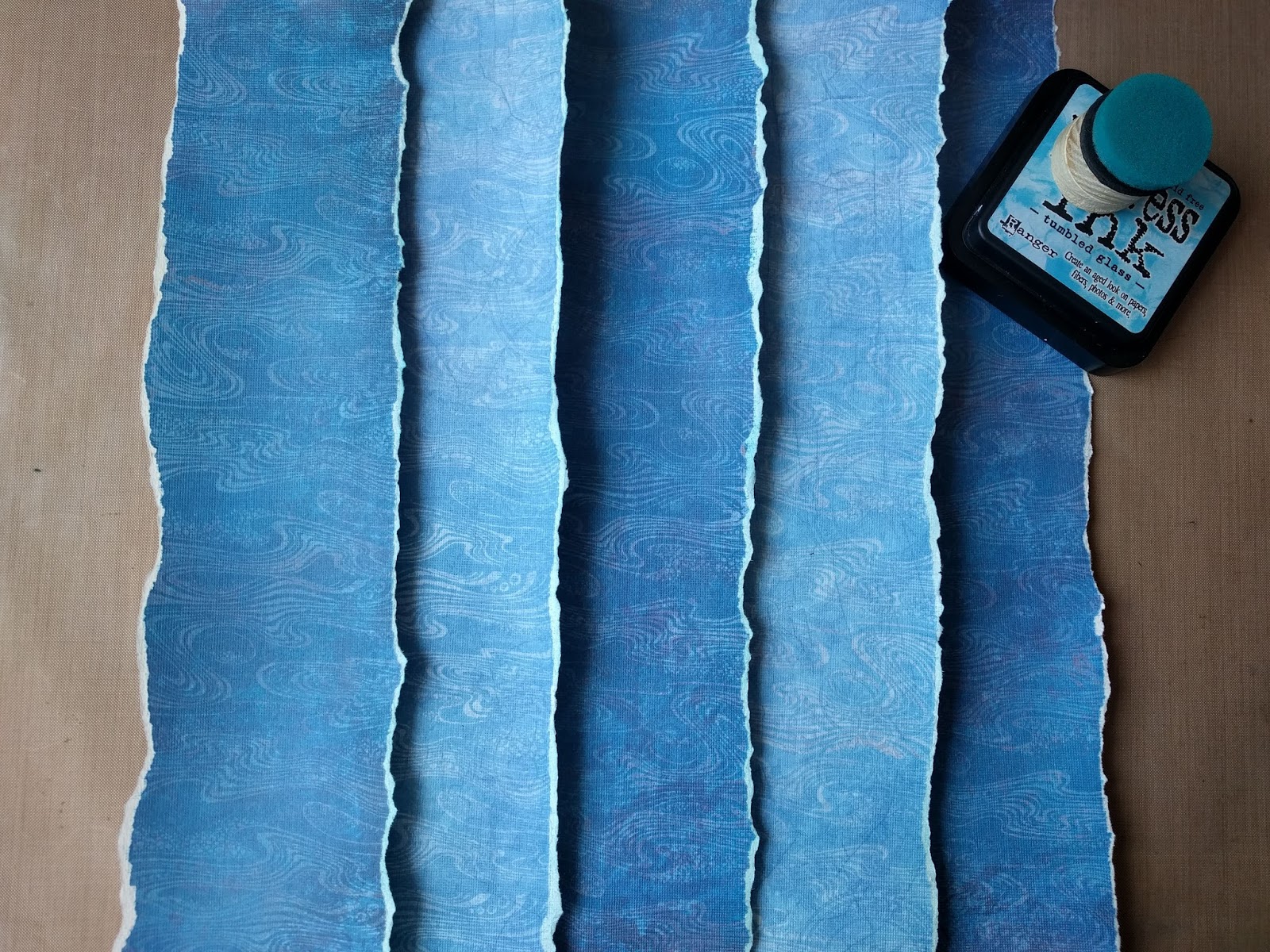
I used two patterned papers and changed them with the use of stamping resist with acrylic glazing medium and a few blue colors of Distress ink pads to reveal the pattern of the stamp and mimic the sun light rays under the water. 
I colored the sea creatures with Distress markers and created the bottle from two layers of acetate sheet. For the stopper I used a piece of selfadhesive cork sheet. 

For the stamping I mixed a few of the Chocolate baroque stamp sets, mainly Steampunk Funky Fish and Steampunk Sea World, a nice flower stamp from October Fairy, coral reef and quote from Seaside Dreams, grass from Awesome orchids, the birds from Landscape Edges, texture from sand from Texture Fragments and finally water texture for background from Harlequin Fragments.  It seems to bee a lot of stamps, but in fact if was not so much and they matched together perfectly :0)

It was a great pleasure and a big fun to use these stamps again an you can find the photo tutorial bellow :0)

Thank you for stopping by, have a nice day and see you next time :0)

14.6. 2017 - Two worlds


1. used stamp sets


2. stamp all the elements


3. cut them out


4. first "how it could be" assemblage...


5. background acrylic medium resist - original papers and the result after stamping, drying and over-coloring with Distress ink. Colors reveal the stamp pattern.
Before stamping I spread a thin layer of the medium on the acetate sheet with a brush and then stamped the stamp into it and on the paper. After finishing is really necessary to clean the stamp  immediately and completely with (soapy) water before the medium will dry on it and ruin it. Medium (wet or dry) is clear an almost invisible on the paper, so only the coloring will reveal it, but the page needs to be completely dry before that.


6. background stripes assemblage. Some parts are over-colored again with Distress ink.


7. background stripes glued together for final layout


8. creating a light rays on the background with darker Distress inks.


9. two acetate sheets cutted in the bottle shape according to the hand made paper template. Upper sheet colored from inner side with grey alcohol markers to create the ilusion of the clear glass.  Bottle stopper cutted from selfadhesive cork sheet and stamped.


10. acetate bottle - first assemblage. The paper waves are torned out from the rest of the background papers. The boat and stopper are between the two acetate sheets.


11. second "how it could be" assemblage...


12. coloring of the elements


13. framing the colored pieces with black alcohol marker. It helps with the dimmension of these pieces on the layout.


14. final assemblage before framing on the white cardstock


15. final art journal page Two worlds :0)


Wednesday, 28 June 2017

Art journal page - I feel great

"I feel great" - art journal page in Canson Mix Media middle art book - 17 x 25 cm (cca 6.5" x 10")

Just a simple page with a mixed Distress inks and Distress oxides background. I used Salty ocean, Mermaid lagoon and Tumbled glass Distress inks - put them on my craft sheet, sprayed with water and dipped the paper in it. Then I layered Broken china and Faded jeans Distress oxides over it with the same technique. As a final layer I used Hero arts Unicorn white pigment ink stamped with the cloud stamps from Katzelkraft. I wanted more natural sky, so I spritzed the page with water and carefully let the pigments mixed horizontally. The final result was very good :0) Nevertheless I used white acrylic gesso to define the top of the clouds more. I also cut the top parts of the clouds from the paper, so I can place my fish also behind them :0)
All these cute fish are from Chocolate baroque steampunk themed stamp sets and I colored them with Tombow Dual brush pens and Distress markers and framed with Faded jeans colour. Finally I added white shading with a colored pencil and Sakura Souffle gel pen.

My quote - a short poem - reflects the feelings of the day and in English could be approximately like this:
"I feel great, it's not a dream,
like a fish in water stream.
What's the water? Who knows it ever?
I might even float in heaven...

Have a very happy day and thanks for stopping by :0)


27. 6. 2017 I feel great


Tuesday, 17 January 2017

Creative weekend 4 - "New Year's resolutions" and "Beauty of pear"

Two new pages in Seawhite hardbound 7.5"x7.5" (ca. 20x20 cm) journal. First ones in this year :0)

"New Year's resolutions" made with Dylusions and  Distress acrylic paints, LaBlanche stamp and Dylusions white and black pens and "Beauty of Pear" with Distress stains, paints and markers, Penny Black stamp, simple masking technique, Distress Vintage photo embossing powder, "Perfectly penned" alphabet stamp set from Concord & 9th and beautiful white mulberry paper.

14.1. 2017 New Year's resolutions


15.1. 2017 Beauty of PEAR


Thursday, 5 January 2017

2016 Christmas cards

Christmas cards for 2016...that was quite an adventure :0) Sometimes your idea seems to be easy and then, during a realization itself, you find out that things go wrong or at least other way than you've imagined. So you change your plans and start again and leave this part and add another....and at the end there is the day when you really need to finished it all and send all your best wishes to your beloved as soon as possible. So you focus hard to make the cards almost perfect...during the morning, during the day, during the afternoon and evening and even the night...and at 6:30 a.m. you decide not to go to bed at all and keep your eyes open even a while longer so you can go to the post office after they open :0))
But i think it was worth it and I'm very happy that this year I also included a small gift for everybody - the bookcase with wishes of "Happy year" made with love, because I think that we all need a happiness in our lives :0)

Embossed white cardstock base colored with archival and distress ink pads plus colour cardstock background embossed with white embossing powder and colored with archival inks / colour cardstock background embossed with clear embossing powder and colored with archival inks.
Medallions: colour and white cardstock colored with distress ink pads, stamping with Ranger Black soot archival ink. Bunnies and trees colored with Distress markers and sealed with Distress micro glaze wax. Silver "mirrored" stars. Dimension to the frames added with white craft foam circles.
Bookmarks: background colored with alcohol markers, bunnies and books with Distress markers sealed with Distress micro glaze. Embossed with Wow! Metallic gold rich pale embossing powder and gilded with double sided tape stripes and gold foil from Prima. Text stamped with great "Perfectly penned" alphabet stamp set from Concord & 9th. White ribbon colored with matching alcohol markers. 

So have a great year 2017 and a lot of happiness in it :0)


Sunday, 9 October 2016

Creative weekend 3 - "Rose is a rose is a rose"

Simple "Rose is a rose is a rose is a rose" page in my new Seawhite hardbound 7.5"x7.5" (ca. 20x20 cm) journal :0) Distress ink pads background, stenciling through two stencils lying on each other, stamping without and with masking technique and coloring with Distress ink pads, Distress markers and white colored pencil...

9.10. 2016


Wednesday, 21 September 2016

Tim Holtz Creative chemistry 103 adventure ends....or maybe not :0)

So here are my tags from Tim Holtz's Creative chemistry 103...


Day 1 techniques:
Distress DIY ombré (tags 1-3), Distress highlight stamping (tag 4), Distress off-set stamping (tag 5), Distress washed watercolor (tag 6), Distress Micro-glaze resist (tags 7-8)


Day 2 techniques:
Distress paint resist (tags 1-2), Distress paint lifting (tags 3-4), Distress stain rub resist (tag 5), Distress luminous mica (tags 6-7), Distress marker spritzed watercolor (tags 8-10)


Day 3 techniques:
Distress layered collage (tag 1), Texture paste coloring (tag 2), Texture paste embossing (tag 3), Texture paste resist (tag 4), Distress grit-paste grunge (tag 5)


Day 4 techniques:
Distress crayon smudge (tag 1), Distress crayon gesso fresco (tags 2-3), Distress crayon texture resist (tag 4), Distress crayon watercolor resist (tag 5), Distress crayon blended background (tag 6), Distress crayon layered coloring (tag 7)


Day 5 techniques:
Alcohol ink stamped resist on Yupo (tags 1-3), Alcohol ink texture resist on Yupo (tag 4), Alcohol ink painting on Yupo (tag 5), Alcohol ink faded layers on Yupo (tag 6-7), Alcohol ink liquid landscapes on Yupo (tag 8), Alcohol ink splattered florals on Yupo (tag 9)


Tim Holtz Creative chemistry 101 adventure

Summer was quite busy, but I still had some time for creating. I spent few very nice weeks with Tim Holtz's Creative chemistry courses 101, 102 and 103 and it was a great adventure to discover or re-discover all the techniques he shows in his video lessons :0)

On the beginning of Creative chemistry 101 I decided not to use only Tims's Manila cardstock, but try a different kinds of papers I have and I could use in the future for my art pieces instead, so I have a better references how these papers behave, how they take water, colors and stamped images. I used more than 10 types of papers - watercolor, mixed media, kraft, black, specialty, even photo paper and mostly I was very happy with the results, although sometimes was a bit difficult manage the technique on them. And if I loved some technique a lot I made a few (or more) tags with it :0)

So here are my tags from Creative chemistry 101...

Day 1 techniques:
Blended spritz and flick (tags 1-4), Brushless watercolor (tags 4-5), Wrinkle-free distress (tag 6)


Day 2 techniques:
Alcohol ink agates (tags 1-2), Archival resist (tags 3-4), Reflections stamping (tags 5-9)


Day 3 techniques:
Watercoloring with re-inkers (tag 1), Layered misting (tags 2-5)


Day 4 techniques:
Stained kraft resist (tags 1-4), Stamping with stains (tags 5-6), Marbled stains (tags 7-8)


Day 5 techniques:
Watercolor with markers (tag 1), Blending with markers (tag 2), Stamping with markers (tag 3-5)


Day 6 techniques:
Rusted enamel (tags 1-3), Nostalgic batik (tag 4), Distress powder resist (tag 5)


Day 7 techniques:
Dabber resist (tag 1), Crackle paint resist (tag 2), Shattered stains (tags 3-4)


Day 8 techniques:
Perfect distress mist (tags 1-2), Perfect distress (tags 3-4), Perfect splatter distress (tag 5-6)
Day 9 technique:
Rock candy distress stickles (tags 7-8)